Art 2 Final Exam
|
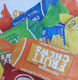
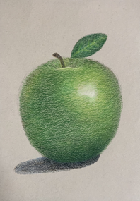
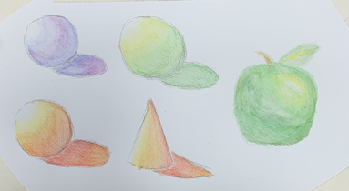
2. Two of my pieces from this class that show my growth as in artist is my candy prisma color drawing and my apple prisma color. I picked both of these pieces because I feel like in prisma I have become better at making the pieces look more realistic by the use of shadows and highlights. From the assignment of the apple, I learned how to layer different prisma colors as well as use colors that may not seem like they would be used such as purple and blues. I also learned to color by shading around the shape for it to look three dimensional and not flat. For prisma colors, I lightly shaded my pieces because of how pigmented and soft they are. Regular colored pencils are stiffer and cause you to press harder for color so I learned to use the prisma colored pencils lightly. For the prisma color candy, I took what I learned from the prisma color apple and incorporated those methods into the piece such as using colors you may not think you would use and completely blending the different colors to not create harsh lines. With these assignments, I found my favorite medium to use being prisma colored pencils because of the amount of control and the soft look it creates.
|
|
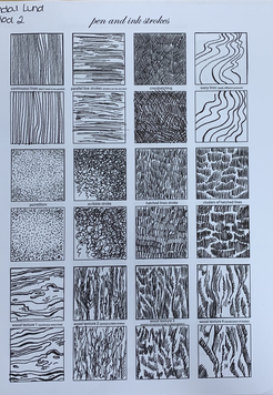
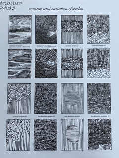
4. The first mini lesson that I found was the most beneficial was the pen and ink strokes. Before this class, I never worked with pen and ink but with this practice assignment, I learned how to create various different textures such as fur, wood, and trees. Some of the different strokes required thicker black lines and others as more thin. To create the different textures, those that were thinner required a lighter force and thicker textures required a harder force on the pen. The second mini lesson that I found very beneficial is the water color shapes. I took painting last semester and the hardest part of the class for me was watercolor. The reason behind this is because it is a very hard medium to control. I found with this mini lesson, I learned to control watercolor more by using watercolor pencils instead of water color paint. The colors stay in place easier by using the pencils and don't mix as easily.
|
|
|
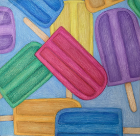
6. My favorite medium to work with was prisma colored pencils. I enjoy this medium the most because of the amount of control and various colors. I'm able to blend the different colors easier than watercolor and acrylic to create the realistic and three dimensional look. With prisma colored pencil, you are able to color with the shape to have the piece not look flat. The medium is also more forgiving than watercolor and pen and ink so if there is a mistake made, it's easier to fix and cover up. For my popsicle drawing, I was able to add highlight over dark areas of the piece. For pen and ink as well as watercolor, you have to place the highlights at first because once the darks are added, it cannot be undone. I love artworks that are colorful and bright and well as added shadows which can be done by prisma colored pencils. Pen and ink, is just black and white and doesn't catch my eye. Shadows added to watercolor can look muddy and for me is hard to accomplish.
|
|
|
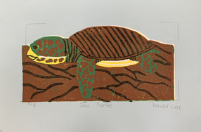
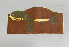
7. The project I felt I was least successful with is the printmaking of the archelon sea turtle. The reason I feel this way is because of how unaligned the prints are with each other. Along with that, the picture does not look very realistic. In different mediums such as prisma and paint, I feel the pictures look more accurate as well as three dimensional. With printmaking, if you make a mistake with the colors, it is sometimes not possible to fix. For the white ink, I forgot to use the gouge to cut out the part in the eye for that color. Since I forgot to I had to use another color so I decided to use yellow ink which is the second lightest color that I picked for my printmaking. What I would do differently in this piece is create a different texture in the ground as well as outline the brown spots on the turtle. I would also add design like a dark blue in the water to not look as flat.
|
