Painting Portfolio
|
|
|
Street Scene
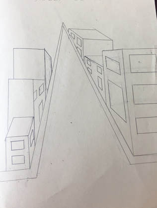
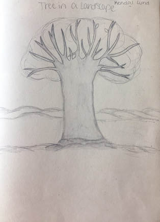
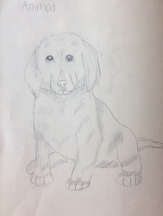
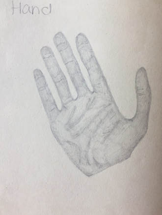
For this assignment, I was to draw a tree, an animal, a hand, and buildings on a street with no reference photos and just on the top of my head. I feel like I did good with the shading and placement of the objects for my drawings. I had trouble with the buildings and what angle for the buildings, windows, and doors to lay on and also the details on the dog and the tree without looking at a picture to help me along the way.
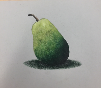
Drawing of a fruit (pear)
Water color painting practice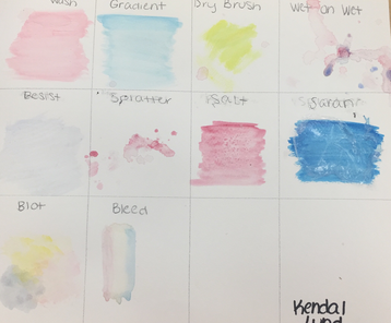
|
|
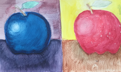
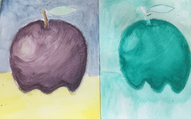
Watercolor Apple
|
|
For my watercolor apples, the techniques I used is for the blue apple, I used all cool colors. The second Apple I used all warm colors with the technique of salt. The third Apple I used complimentary colors which are purple and yellow, and for the final Apple monochromatic which is using only one color which I chose green.
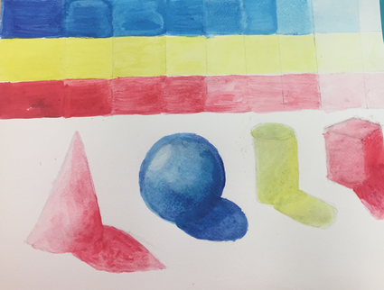
Watercolor Sketch
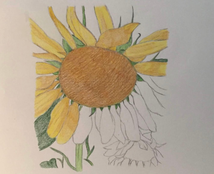
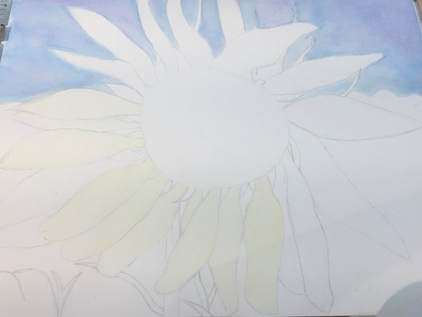
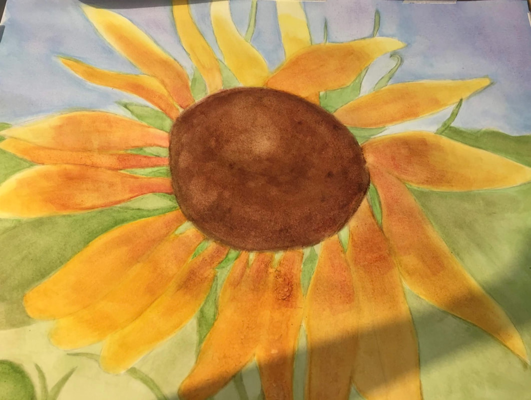
Watercolor In Progress: Sunflower
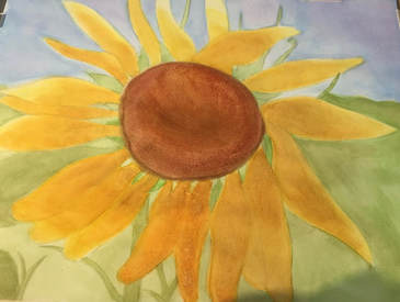
Watercolor Final Artwork: Sunflower
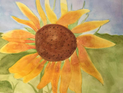
1) Watercolor techniques that were proven to be effective in my watercolor is the layering of the colors to create what I needed for the picture. The red,orange, and yellow were layered to create the color of the sunflower petals along with the sky I used purple and different blues to blend.
2) The use of transparent layers helped to layer and blend the color for the watercolor. Using heavier layers affected the blending of the colors and the softness of the painting. Transparent layers helps darken colors in places that are needed.
3) The composition was successful because the different shapes of the petals helped the flower to look more realistic and not too balanced and "perfect". Random strands of grass and leaves poking out of the flower and the background helped the background not look as plain.
4) The color choice of the painting helped it to become alive and look more realistic. Using colors that are more hidden in pictures, by adding those into the painting had the flower look more real. If I had only used one shade of a color such as the yellow, that would make the picture look more flat and not as 3-D and accurate.
5) My craftsmanship on this painting was the ombre effect in the grass and the sky from going dark to light. The area that the light was supposed to be hitting on the middle part and the end of the petals I was able to lighten by putting very thin layers.
6) If I were to do something different I would add darker shades of the green and more of the red on the petals to look more realistic along with blending the color more and for the image to pop. I would also add more areas of highlight on the petals at the end to show the light hitting the petals along with the leaves surrounding the flower.
7) What I have learned about watercolor is how light of layers you need to do to build up the color. I have also learned when in the middle of watercolor layers, there needs to be drying time so the watercolor will not group up or come off of the watercolor paper. I have also learned how many layers there needs to be to create darker colors such as the dark brown in the middle and the dark green on the leaves and grass. I have also learned lighter colors unlike blacks and browns work better in watercolor since watercolor is more of a softer painting element.
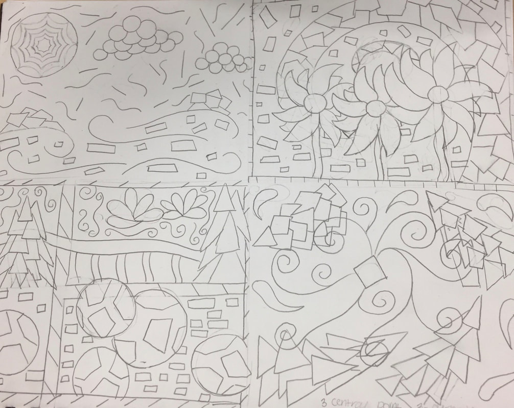
Hundertwasser Painting Sketches:
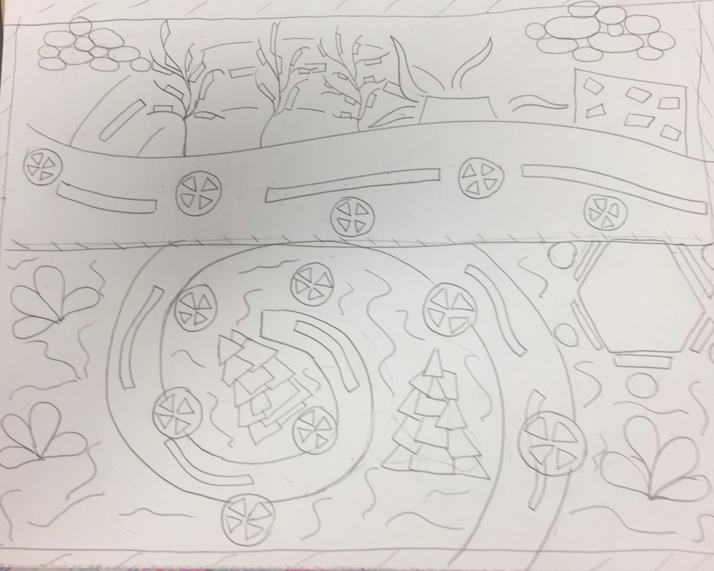
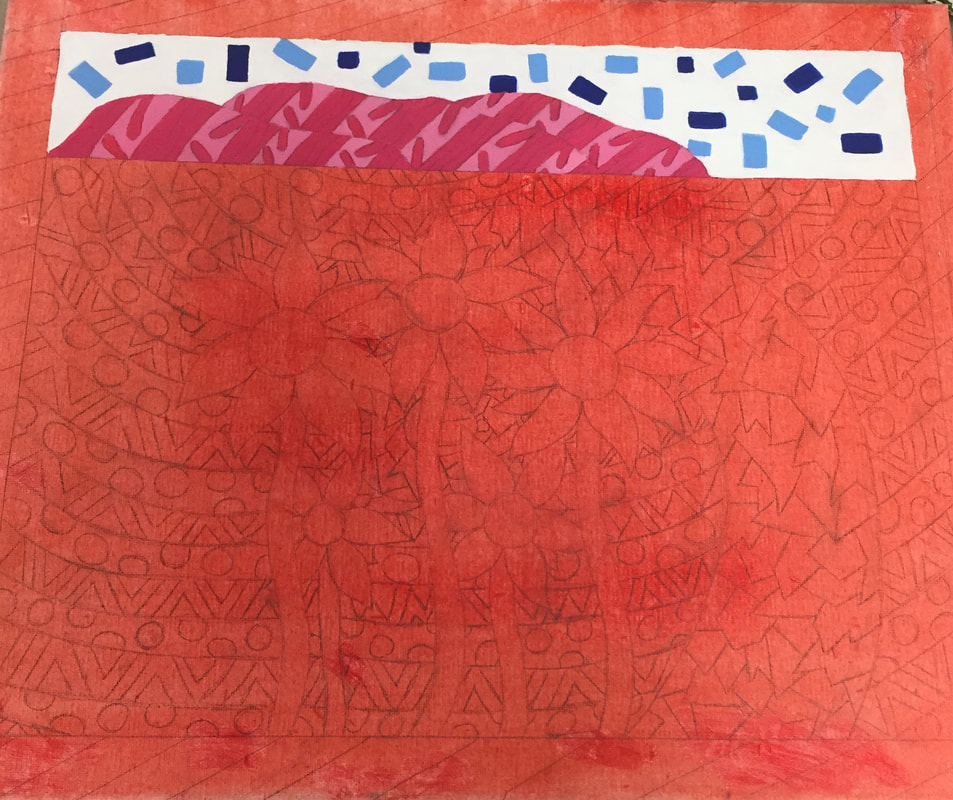
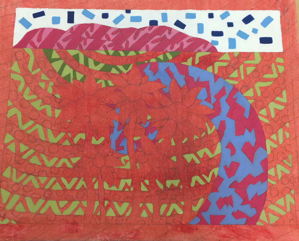
Hundertwasser Painting in progress:
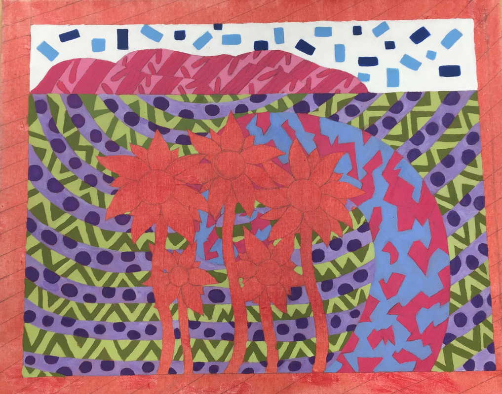
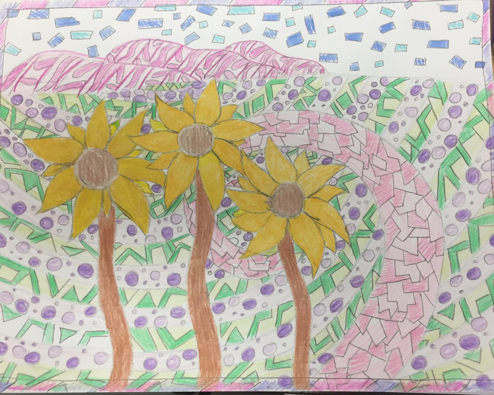
Hundertwasser Final Artwork:
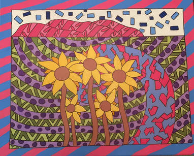
1) The craftsmanship of this painting is very neat and outlined in black with an exception of the border. I carefully rounded the pathway which spirals into the middle where the flowers are located. The rows located on one side to the other is lined out smoothly.
2) My artwork embodies Hundertwasser's style by having a spiral effect towards the center of the painting to draw attention to the middle where the sunflowers are. I also used imperfect shapes in the pathway and the hills in the background. Hundertwasser also uses borders on the outside of his paintings which I did and decided to use stripes.
3) My choice of colors were very bright and popped yet using color in some areas that somewhat are realistic. Most of the paint I used I mixed with white to make the color brighter, lighter and more opaque. I used yellow on my flowers to show that they were sunflowers and two shades of green in the pathways for the grass.
4) The emphasis of my artwork is the spiraling path which leads to the focus of the sunflowers that are in the middle of the painting. The use of blue and pink throughout my painting and then using yellow on my flowers helps the sunflowers pop in the painting and draw more attention to them.
5) I used many patterns throughout my artwork mainly surrounding the flowers all around. In the paths located behind the pathway, I created rows and since there were a lot of patterns I decided to keep it more simple for the border. For my sketch in the beginning, I had more patterns in my path leading to the flowers but then while painting decided to have it not as busy which I think helped not to blend into the rows.
6) For the border I decided to just do stripes to not create as much attention. With doing that and by not outlining it, the focus is more towards the center of the painting. With my theme of blue and pink throughout the painting, the border helped to have those colors not only for the path, sky, and the hills, but the outside as well.
7) Difficulties I had creating this artwork was the layering to make certain colors more opaque. The dark purple on the dots located in the rows were hard to build up so I added a tiny bit of white to help the color not be as transparent. The dots along with the dark green required more paint then what was first made. I had a little bit of difficulty recreating the colors to match but I think in the end, worked out. Not only running out of paint but with the paint drying from the weekend along with the days off from the hurricane was a bit difficult to remix the colors and get the perfect shade. The blue used in the border required many layers as well.
Apple Oil Paintings
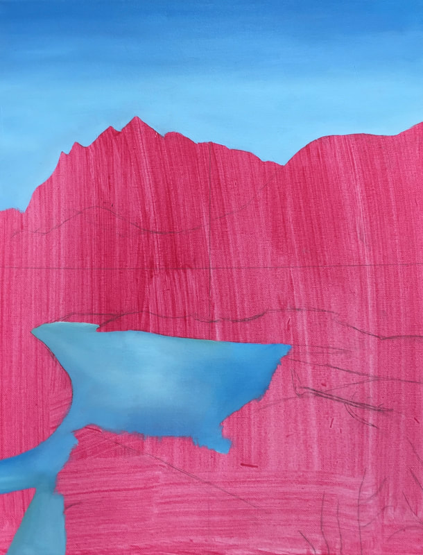
Landscape Textured Painting Sketches

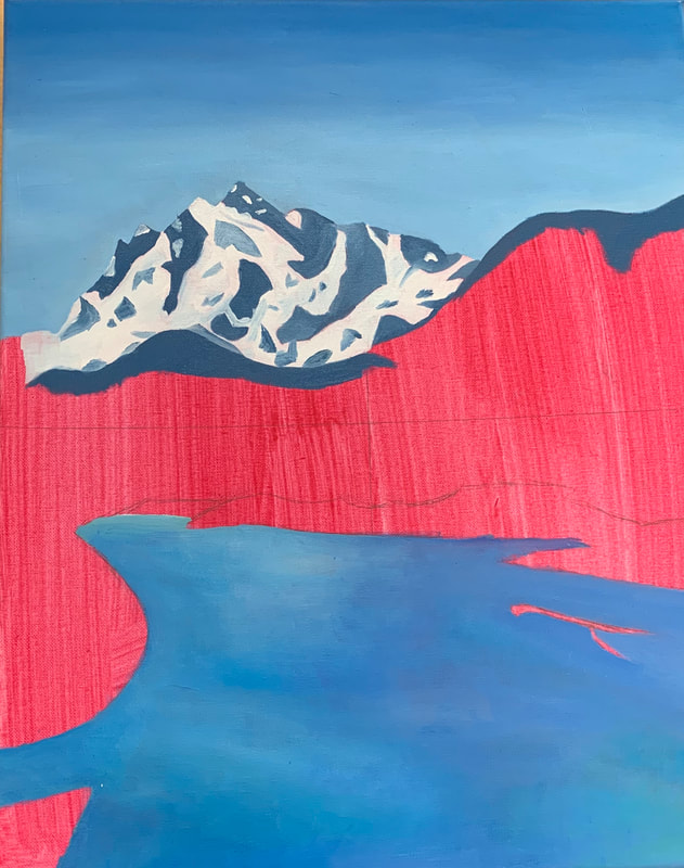
Landscape Textured Painting in Progress
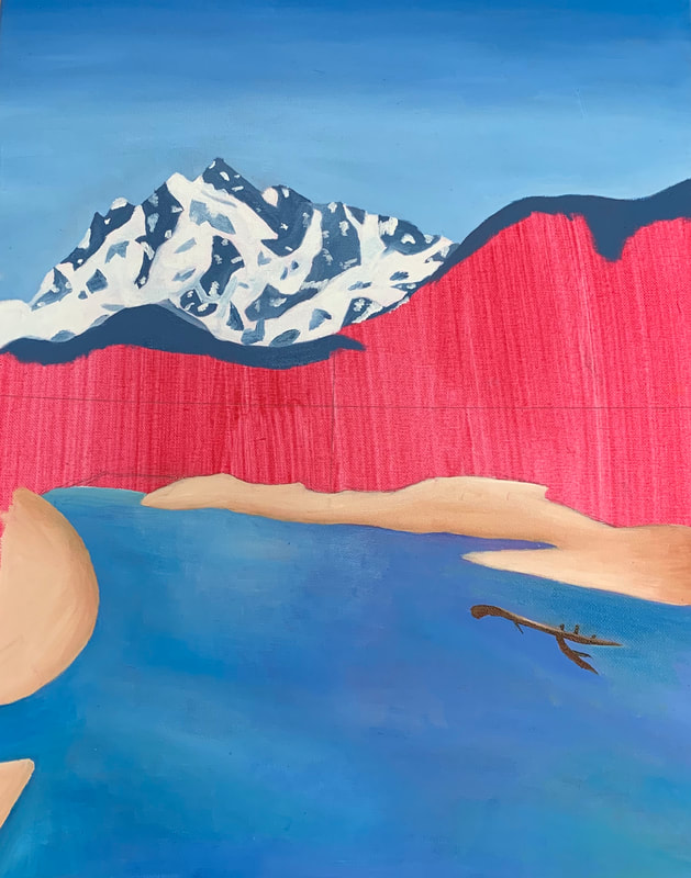
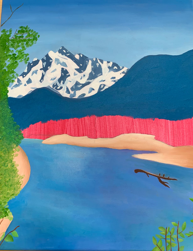
Final Landscape Textured Painting
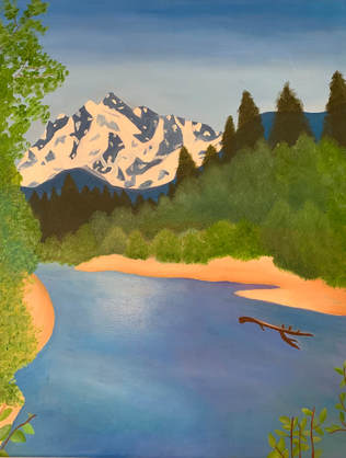
1) The craftsmanship of my painting is very neat and the colors used in my painting work very well together. The different greens I used in my trees along with the bushes helped the painting come more to life. The tan for the ground I think helped the water along with the sky and trees pop.
2) The colors I used work very well together. I used several different shades of green to mix together to make my painting more realistic. The white used in the water creates highlights with the sunlight shining on the water. The transition between the blues in the sky looks very similar to the picture as well.
3) How I created contrast in my painting is the land part of the painting, I decided to not use a blue grey color in the picture that I based this painting off to have a change and so the land will not blend into the water. I think this had the water along with the trees stand out more than in the picture.
4) Textures in my painting are on the bushes along with the trees in the background and the large tree on the left. Highlights in my painting are in the water mainly in the middle where the sun shined on it. The use of shadows are on the land and the water where there are darker shades from the trees blocking parts of the sun.
5) Ways I created depth was in the different colors in trees and bushes with the further trees and bushes having a darker green color to them and the ones closer have a brighter and lighter green color. The sky also ombres from a dark blue to a light blue showing how far the mountains along with the trees are.
6) Painting techniques I used to make my painting that were successful are the blending of dark and light colors to create depth in the painting. I also did stippling on the trees and the bushes to create a texture and make the painting look more realistic. I used an under painting as well to help with contrast.
7) Difficulties I had with this painting was the blending of the colors in the water to seem very smooth and blended. The mountain in the background was hard to paint because of the small details of the snow on the mountain. To blend the highlights in the water as well was hard to do and not to look rough and not blended.
8) Successes I had in this painting were the bushes and trees with the different greens I used and the textures. The purple, blues, and the white used for highlight in the water had it look realistic and have depth. The dark and light colors on the land looked very realistic with the shading.
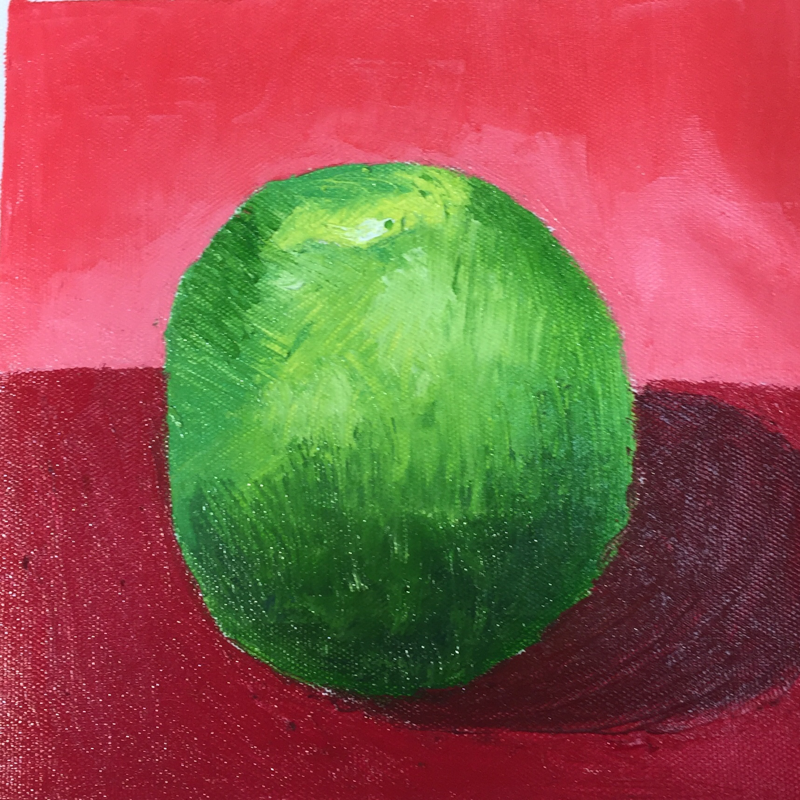
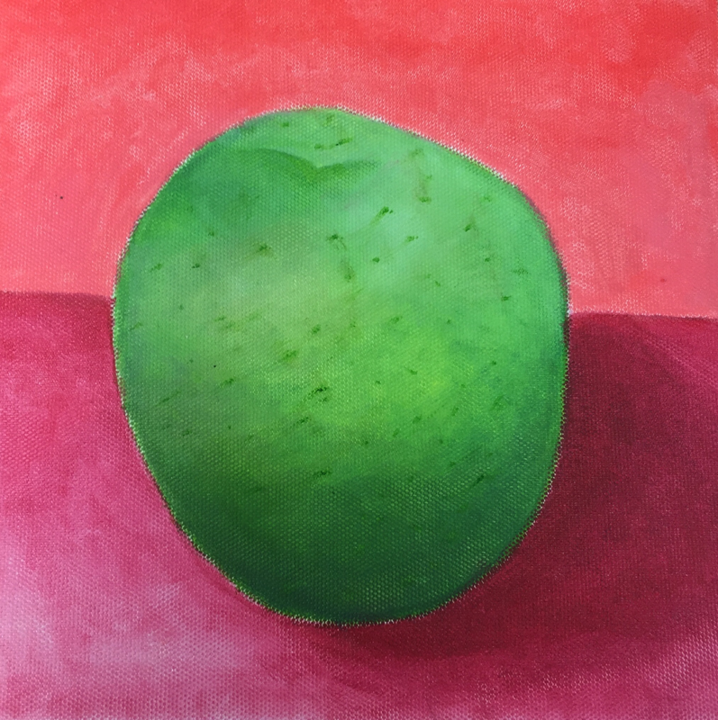
Oil Still Life
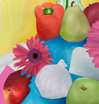
The oil still life was of a table filled with fruits and colorful fabric surrounding. I used different colored oil paint to blend into fruits along with the fabric to look realistic. I found this project hard to make look realistic but I feel this turned out good and I worked well with shading and the highlights on the fabric.
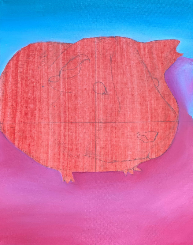
Oil Animal Portrait Sketches
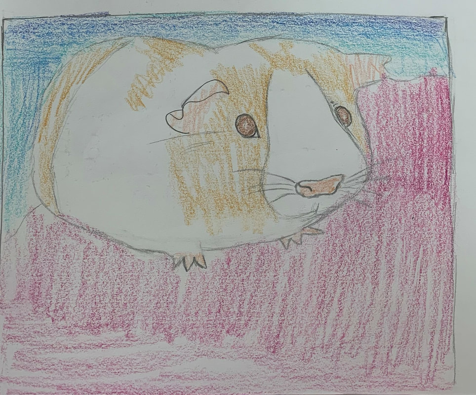

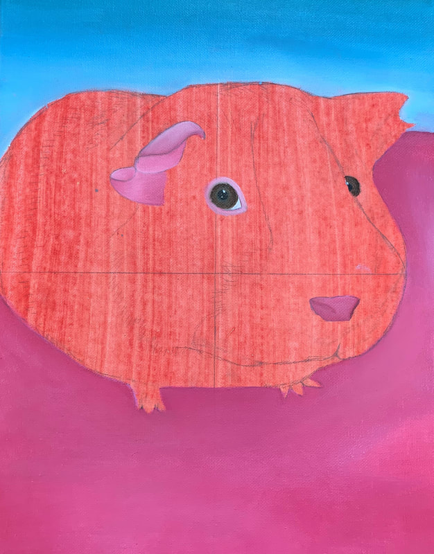
Oil Animal Portrait in Progress

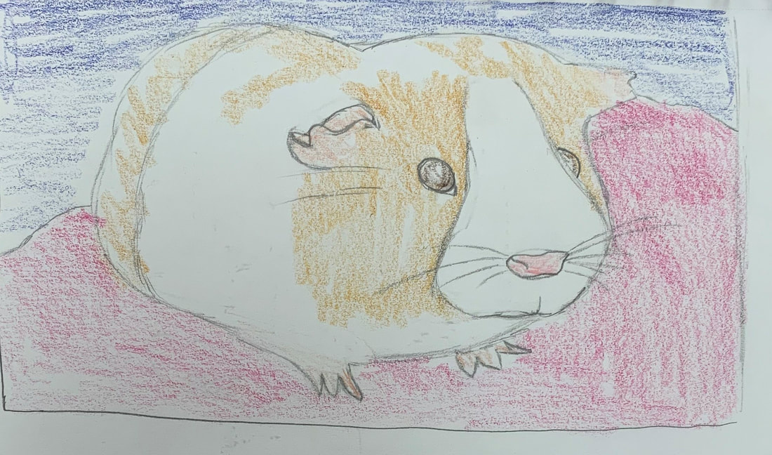
Oil Animal Portrait Final
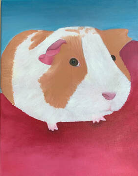
1) I feel this painting turned out really good and shows the texture and different colors throughout my guinea pig. The white throughout his fur do not look like a solid white and shows the pink and gray along his fur. The dark and light colors on his nose as well along with the detail in his eyes.
2) To add texture to my guinea pig using paint, I used dark shades of my guinea pigs fur to look like fur and several strands of it. The background layer to prime my canvas helped create my guinea pigs pink, white color in his fur. I added white on top of the primed part of the canvas. For the background I chose to use solid colors to have my guinea pig stand out and pop out more. I ombred my background from dark to light. The most important aesthetic quality of my painting is the pops of color in the back to help bring out the main focus of my painting.
3) Techniques that I learned in class that helped me create this painting was using different colors other than black such as blue and dark greens to create shadow. I also used to technique of first placing down the darker colors and once died adding the highlights to make the painting look more realistic and show depth.
4) In the beginning of this painting. I wasn't sure how to make the fur of my guinea pig to look realistic and look like strands of hair. I then watched videos and what was shown was starting out with the darker colors and then afterwards adding in the highlights to the fur. That really helped me mainly with the tan of the fur and so the painting did not look like one color throughout and looking flat. The beginning of the painting for the background did not have much shadow and dark colors so later on in the project I started to mix in a little hint of dark brown which changed the background completely and created a darker look to it and matched the picture more. 5) The craftsmanship of my painting shows with the sizing of every part of my guinea pig with the proportions matching up to the body. The colors of the fur matches up very well with the picture that was taken as well. Along with that, the dark and light pink on his ear and his nose look very similar as the picture.
