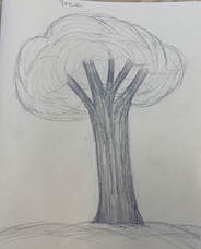
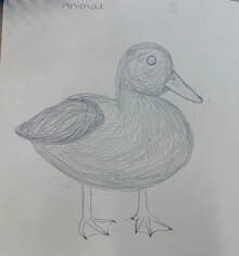
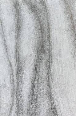
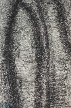
Practice Drawings
|
|
|
|
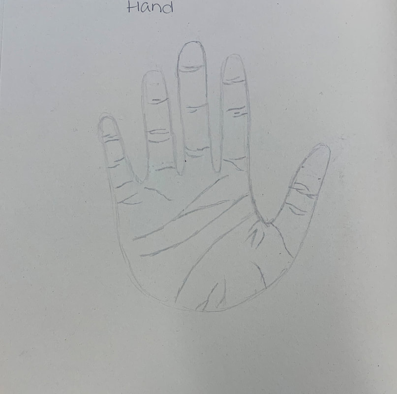
Blind and Modified hand drawings
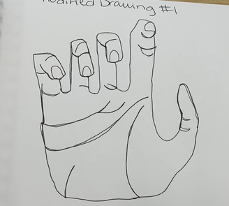
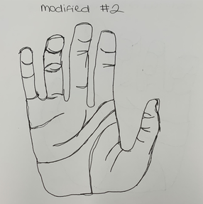
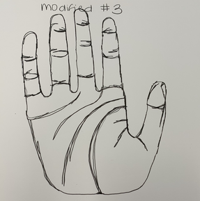
Modified Contour Drawings: #1,#2,#3
|
|
|
For this assignment, I was to draw my hand while looking at the paper without lifting up my pen. I tried to create the indents in my hand to make my hand drawing not look at flat and more realistic.
|
Blind Contour Drawings: #1
|
#2 #3
|
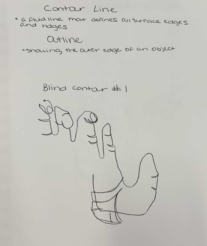
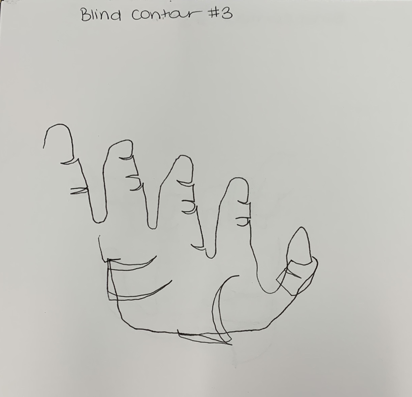
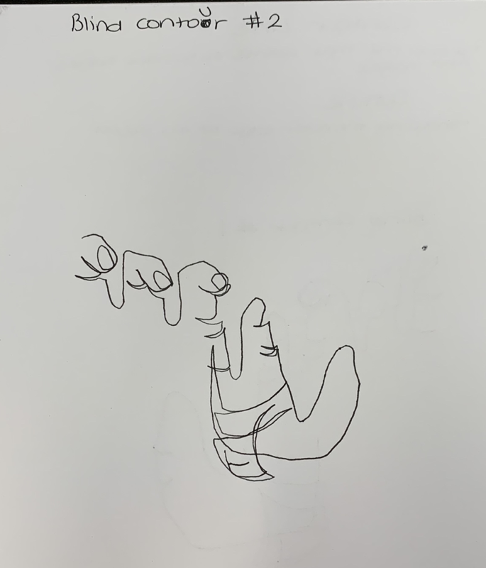
For this assignment, I was to draw my hand without being able to see the paper. Along with that, I had to not lift up my pen and still create the lines in my hand.
Contour drawings of shoes
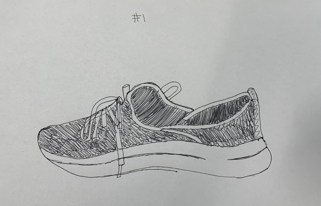
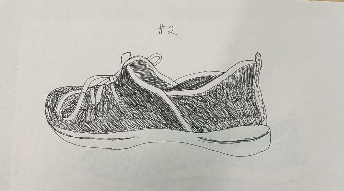
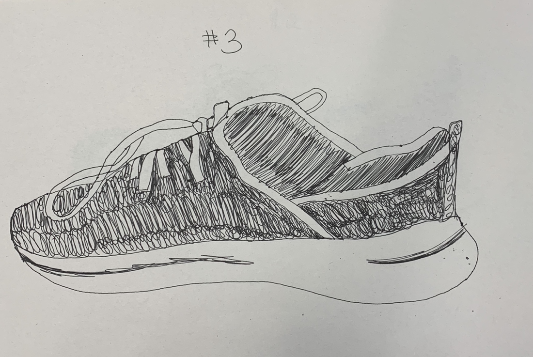
My table had to put a shoe in the middle and draw what we saw without lifting the pen. The challenge was to create the textures and the whole design of the shoe with the pen.
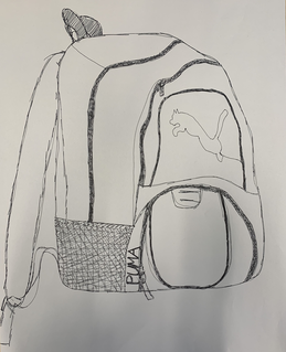
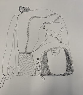
Contour drawings of a backpack
|
|
For the contour drawing of the backpack, I had to draw all of the designs and textures of the backpack without lifting my pen. Along with that, I had to try and create my drawing the same size as the actual backpack.
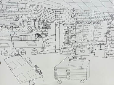
Contour drawing of class
Practice
Final
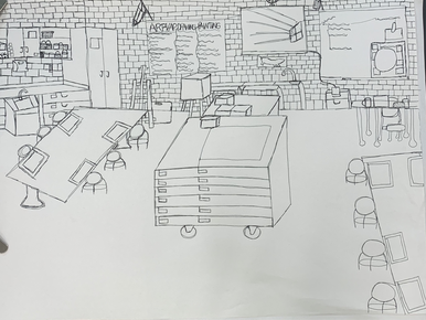
For this assignment, I was to draw the classroom with a pen without picking up the pen to create a solid, fluid line.
Critique Questions on Contour Drawing Of Room
1. For this assignment, I did use a fluid line with pen. The full drawing that I created never had an ending line until completed which can be seen because the picture isn't as clean and neat. On the drawing, there are random lines that were created because I needed to get to another part of the drawing to draw another object. For example, the table in the middle of the room I had to draw a line to the wall from that area since I could not lift the pen. If I did not do a contour drawing, I believe the drawing would have turned out cleaner because the extra lines would not be needed.
2. My knowledge of contour lines helped me successfully draw this piece because it helped me learn all of the detail that goes into drawings. I also learned to work in small sections at first instead of creating an outline and working from there. For the mistakes that I made since I was drawing in pen, I learned how to work around the mistakes to still make the drawing look good. For some instances, I had to find a way to cover up the extra lines or I was able to draw other objects using the extra lines.
3. My contour line drawing is different from an outline drawing because for contour drawings you have to work in small sections and add all the details before moving on to another object or section. For outline drawings, you create the basic shapes of the objects and later on add in the details. For contour line drawings, you are unable to pick up your pen and for outline drawings you can use a pen or pencil and don't have to keep your pen on the paper. I find outline drawings easier to add detail since it's easy to go back to the different objects in the picture and you are able to fix your mistakes better.
4. My interpretation of line is essential in capturing the look of the room because I am able to know what angles to draw the objects to create a three dimensional effect. Along with that, I am able to draw the objects to the correct size in comparison to everything else. Some objects in the picture are not correctly angled which throws the picture off a bit, but I found the lines within objects on the walls and the table in the middle to look accurate. With my interpretation of line, I found I looked more at details with this assignment which helped me to complete the drawing as well as help me on future assignments to come.
5. What I learned from completing this drawing is to pay attention to all the details. Along with that, I learned more about proportions of all objects within a picture to look realistic. If I could recreate my piece, I would probably pick an angle from the room that doesn't have as much going on. I would also practice drawing the tables to make them look more accurate and more three dimensional. I do think my final is better than my practice because not only is there more detail in the picture, but the drawing of the room as a whole looks more realistic.
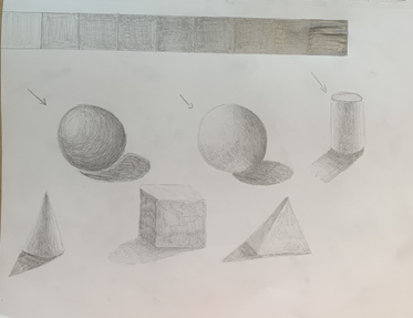
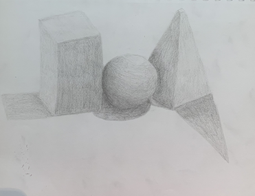
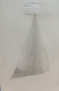
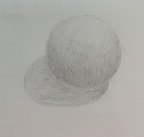
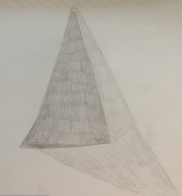
Shading with shapes
|
|
|
|
|
For this assignment, I practiced different values in pencil to create highlights and shadows with different shapes. As a table, we had shapes set up in the center with a light pointed to them to create shadow. We also were assigned to create a value chart with pencil from light to dark. After practicing the shapes individually, we had three of them grouped up overlapping each other to draw the shadow created.
Practice Ribbon Drawing
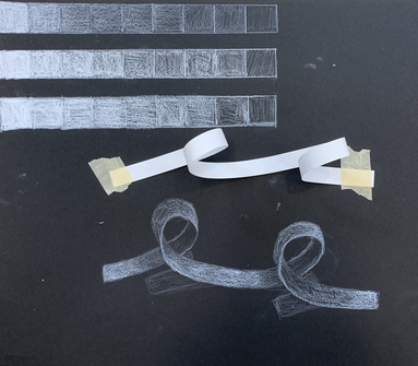
For this assignment, we practice using White charcoal and pencil to create a value chart as well as highlights and shadows from the ribbon. The way I created the shadow effect was by using the actual paper and for the highlights I used prisma color pencil.
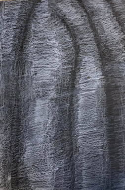
Drawing/ Shading of Fabric
|
|
|
For this assignment, I had to create the highlights and shadows of a piece of fabric with regular pencils on white paper, charcoal on grey paper, and white prisma pencil on black paper.
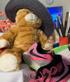
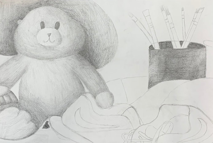
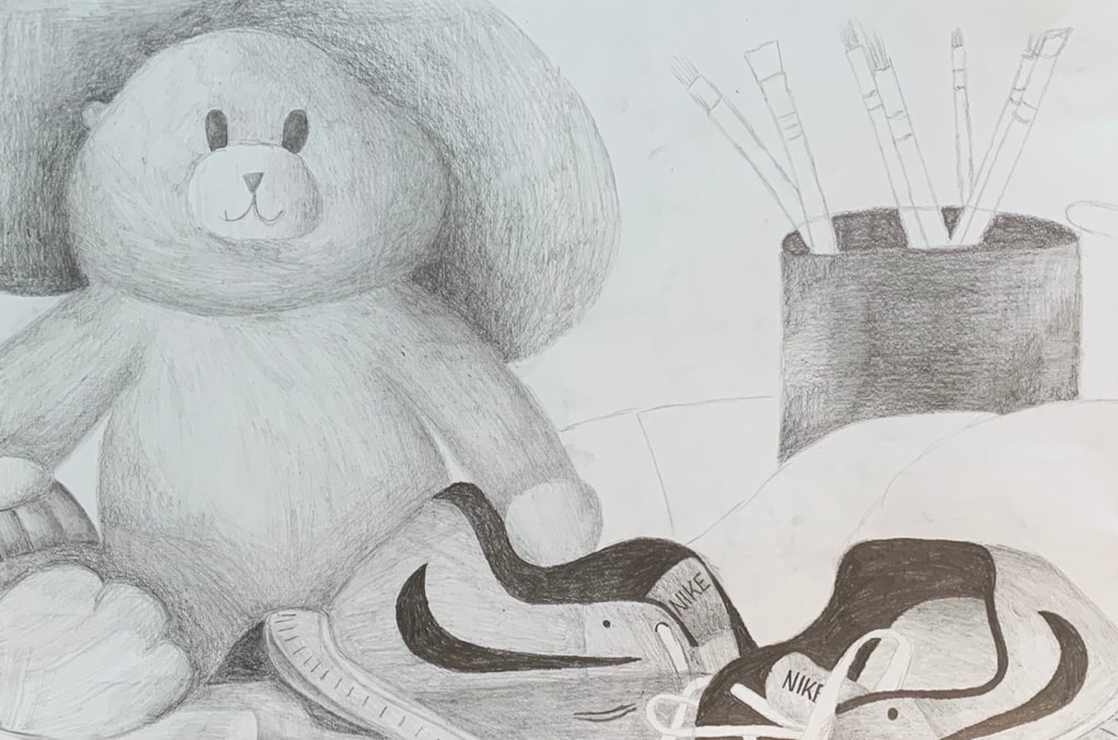
Still Life Drawing
Sketches and reference picture
|
|
|
In progress photos
|
|
|
Final
Questions
1. The craftsmanship of my drawing is very smooth and the pencil strokes blend in with one another. I drew with the shapes of the objects. For example, for the cat stuffed animal, I shaded in a circular motion and for the paint brushes I shaded up and down.
2. The values and shadows in my drawing are realistic. If the object is behind another object, I create a darker shadow to show depth in the drawing. I used a variety of values by using different pencils with different hardness in the led. The pencils I mostly used were the H, HB, 2B, and 4B.
3. The clear source of lighting was at the front of the picture. The highlights were mainly on the front of the bear and the front of the shoes. The highlights are also shown on the side of the container holding the brushes as well as the fabric on the table.
4. The composition sketches were very important to help me learn to fill up the page in the drawings. Along with that, I learned to zoom into the pictures more and not have as many objects in the picture. This allowed my drawing to focus on the objects more and to add more detail.
5. My final drawing was successful by using a large range of value to make my drawing look realistic. The strokes of the pencil helped create the fur of the bear as well as the texture of the bristles for the paint brushes. I was also able to create the smoothness of the fabric, shoe, and container that holds the brushes.
6. The proportions match my reference photo very closely. The bear just like the picture, takes up about half of the drawing. The shoes and the brushes with the container take up the other half of the photo. No object in the picture or the drawing is in the center. There is a good amount of empty space in the back so the drawing is not too busy.
7. The grouping of the objects does create a pleasing arrangement because no object is in the center of the paper. There is also a lot of overlapping with all the objects so the image does not look so flat and the drawing looks more pleasing to the eye. Along with that, most of the objects go off the page.
8. The center of interest is mostly the bear because of how big the object is. The object is not placed in the center and instead is more on the left side of the drawing. This makes the drawing more pleasing to the eye because of the set up of all the objects.
9. In the beginning of the project, I did a good job drawing the placement of all the objects and did not take much time at all. Since I took art 2 before this class, I already had experience with using the different pencils and I have drawn a still life before. I didn't have to take much time planning what pencils to use since I knew what all I needed. I first worked on the largest object which was the bear and worked my way to the right of the drawing. An area I could improve on would possibly be the final sketch of the drawing and for me to not add as much detail since it is just a sketch.
10. Challenges I encountered during this project was mainly trying not to smear my work since I was working to the right of my drawing. Since I am left handed, working to the right was not the best idea but I was able to overcome the problem. What I did was try and not have my hand touch the paper. The other challenge I encountered was trying to create different values on some areas of the objects and not have them blend into one another. I overcame this by creating different values in between and I think that all the objects in the drawing are clearly separate.
11. What I have learned by drawing a still life is that shadow is very important to show depth and the difference between objects. Along with that, I have learned not only shadows, but highlights are very important so the image does not look so flat. Having objects not overlapping each other, does not create a good composition and by having overlapping and objects going off the page does. Finally, having a few objects and not all of them in your drawing is the best. You want the objects to take up the majority of the drawing but you also want room for empty space so the piece is not so crowded.
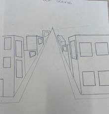
Different Perspective Video Drawings
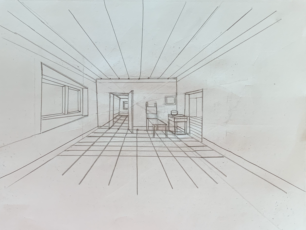
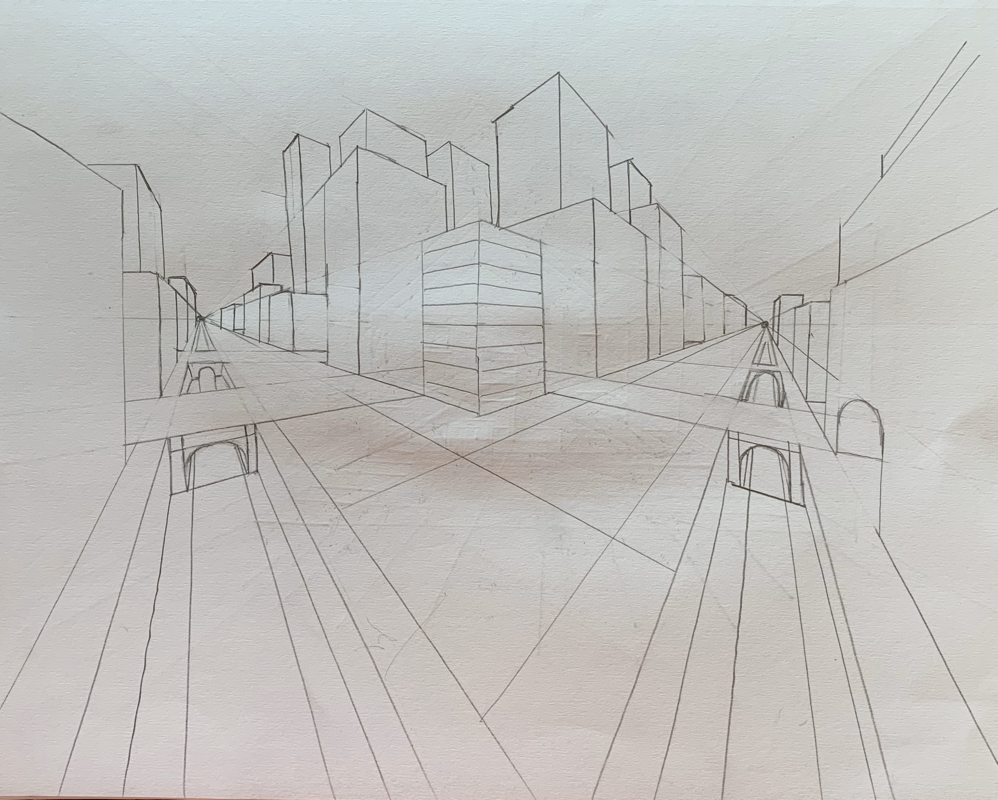
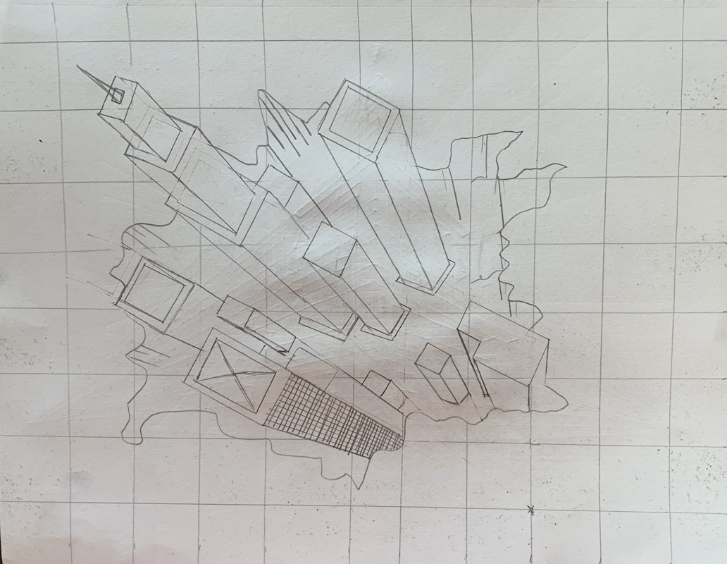
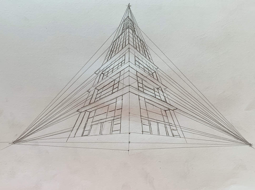
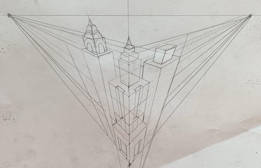
For these assignments, I had to draw from different perspectives following tutorials from videos. The perspectives were 1 point, 2 point, 3D city, 3 point worms eye, and 3 point birds eye. My favorite one to do and the one I found the easiest to do was the one point. The most difficult one I would I had to do was the 3 point worms eye. Overall, these tutorials helped me realistically draw from different perspectives by using different points in a drawing.
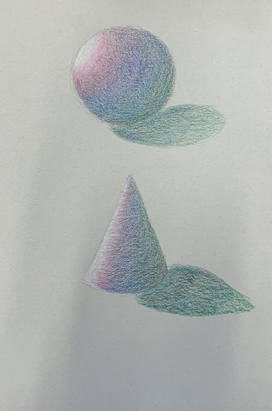
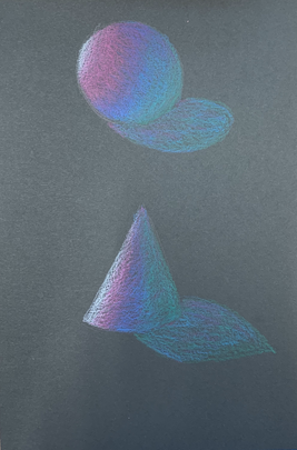
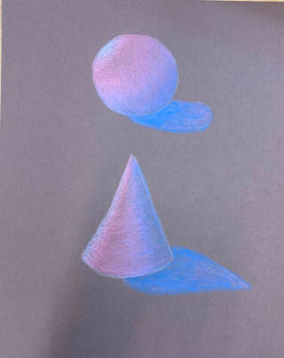
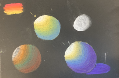
Practice Prisma Color On Shapes
|
|
|
We were to practice blending prisma colored pencils within spheres and cones as well as create a shadow. Along with that, we practiced doing this on different colored paper: grey, black, and brown.
Prisma Color Fruit/ Vegetable: Tomato
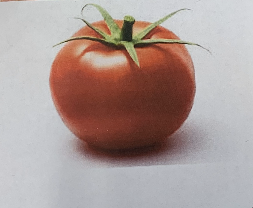
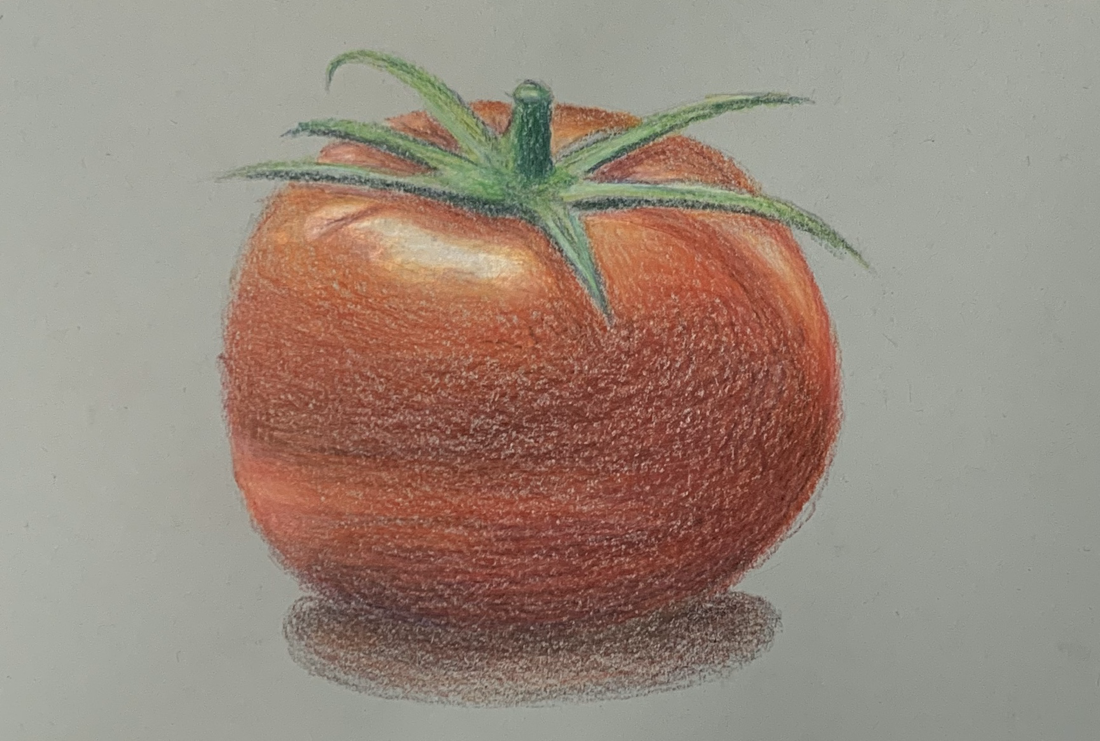
For this assignment, we were to realistically color a fruit or vegetable. We had to use colors that you may not see within the whole picture such as blue, purple, and pink.
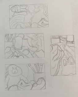
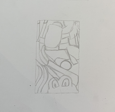
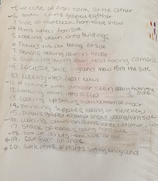
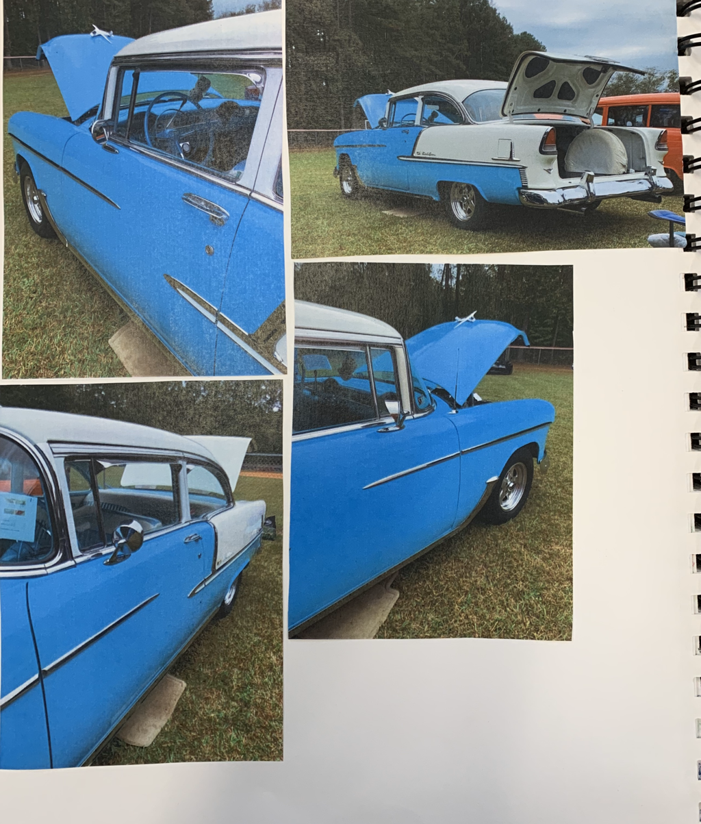
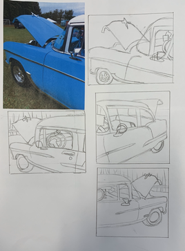
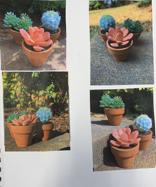
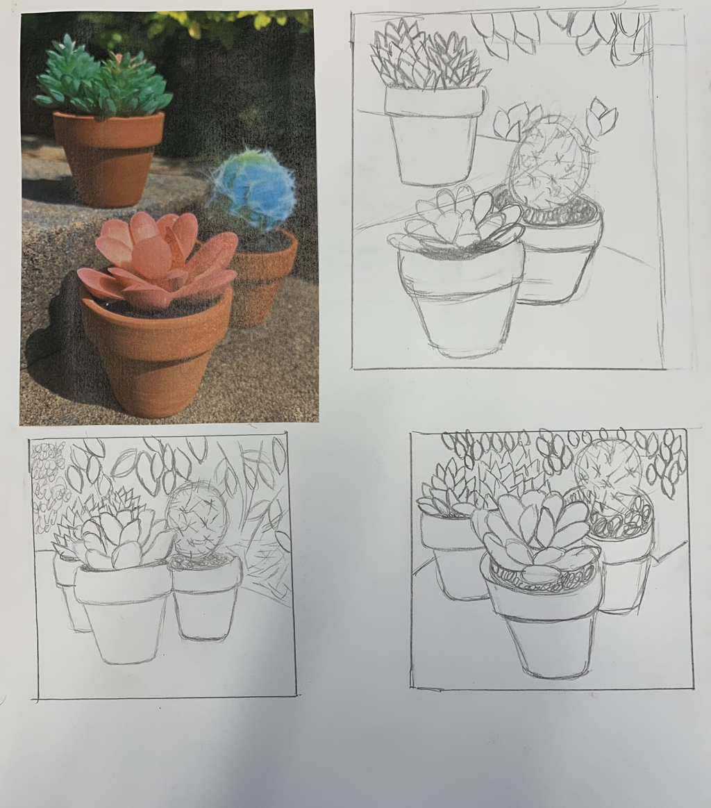
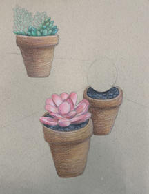
Look At That View
20 Ideas
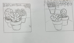
Sketches and Reference Photos
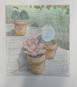
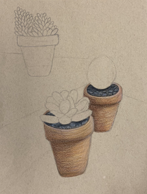
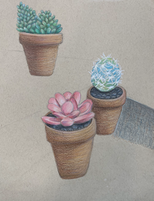
Final Colored Sketch
|
|
|
In Progress Photos
|
|
|
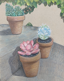
|
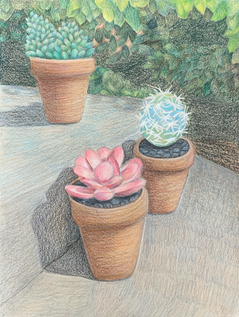
Final
Questions
1. How I created an interesting point of view is I took the potted plants and placed them on these cement blocks in my backyard. I then, got on the grass and held my phone at the same level of the plants. I also placed two of the plants behind the main one located in the front to show depth. This was successful because it shows the goal of the project which is to create an interesting point of view as well as using perspective.
2. It is important to understand perspective to be able to show depth in artwork pieces. To be able to do so, pieces of artwork look realistic and don't look flat. Understanding perspective also helps place the objects in a piece of artwork correctly and realistically without looking like some of the objects are floating.
3. The colored pencil exercises were important for the success of this piece to understand how to create highlights and shadows to make my artwork realistic. Along with that, I learned how to blend colors so there would be no harsh lines. For prisma colors, I learned to use colors I may not see in the picture to create a realistic look.
4. The craftsmanship of my colored pencil was very smooth and I colored with the shape of the objects. I blended many different colors together to create the correct shades for the areas of the objects. I created shadows and highlights to show a three dimensional look for the plants and the leaves in the background. The brighter leaves and the brighter areas of the plants are the areas that are more forward to create depth.
5. I was able to show depth by showing a foreground, middle ground, and background. The foreground is the brighter areas of the front plant (Pink flower) which uses the lightest colors. The middle ground is the other two plants that are behind the front one as well as the brighter leaves. The background is the leaves that are the darkest part of the drawing.
6. My experience with colored pencil was very positive and has become my favorite medium to work in. Unlike different mediums in painting and drawing, I find blending colored pencils to be easier to create a realistic look. Along with that, mistakes can be fixed unlike other mediums that can be harder to do so. Prisma colored pencil can be a tedious at times but once you keep layering and blending, the look you aimed for can be achieved.
7. Techniques or other information I would have like to been taught is how to fix mistakes easier. Along with that, how to create a stronger highlight on objects without the highlight mixing in too much with the rest of the objects' colors. I do feel I was prepared for this project since I have worked with prisma colored pencil in past classes.
Pastel Practice
For this assignment, I learned how to blend different colors of pastel to create a smooth and even transition of colors.
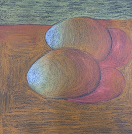
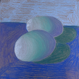
Egg Pastel Pencils
|
|
For this assignment, I had to take pictures of two eggs with a strong light source. I then had to create highlights and shadows using pastel pencils. For the assignment on the left, I used warm colors and for the right, I used cool colors.
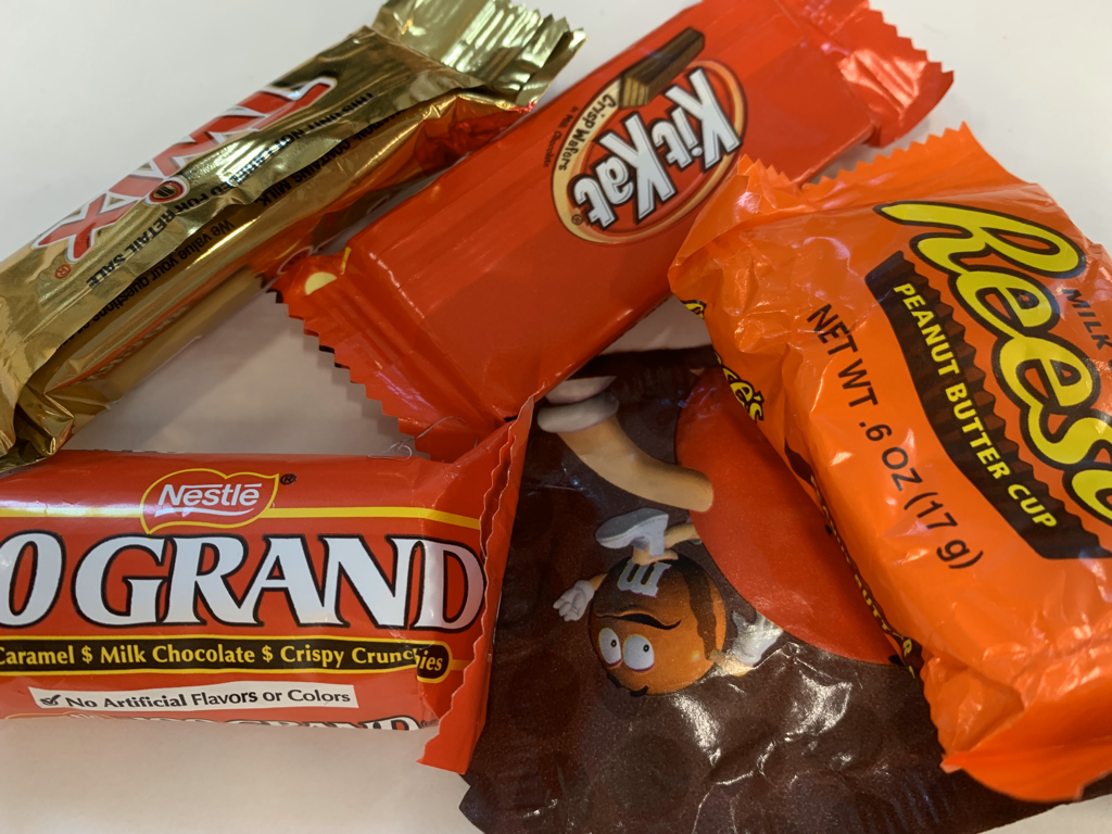
Prisma Color Candy Wrapper Practice
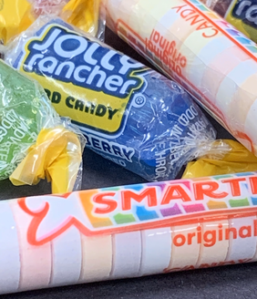
|
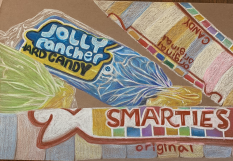
|
The assignment was to draw candy wrappers that had highlights and shadows on the wrappers to create a realistic look. With the second picture, the goal was to create a realistic wrapper look that is transparent.
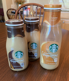
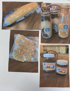
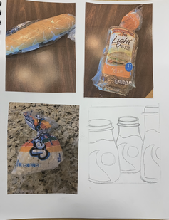
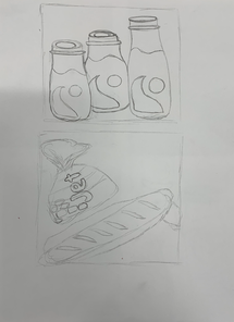
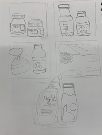
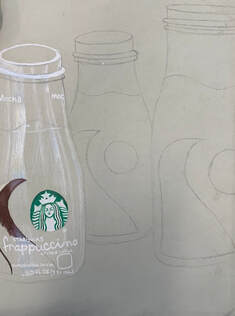
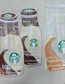
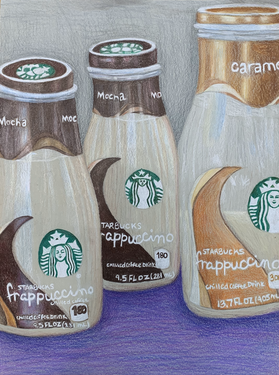
Opacity- Sketches+ Reference Photos
|
|
|
|
|
|
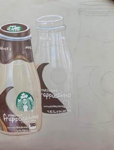
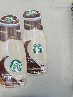
In Progress Photos
|
|
|
|
Final and Questions
Questions:
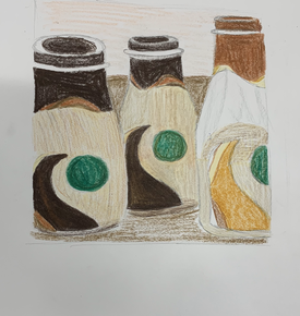
1. The craftsmanship of my drawing is very neat and shaded nicely. I kept the colors within the shapes that they belonged in and the overall piece does not look sloppy. For the white that I used to make the bottles look transparent, I feel that I carefully placed and made the objects look very realistic.
3. For the color harmonies, I decided to use cool colors throughout my piece. I felt that is would help the bottles stand out and would go along with the browns I used. I wanted to use a pop of color in my piece, and since the bottles are mostly brown, I decided to use the brights for the table. In the reference photo, the table is brown as well as the wall. I didn't want my whole piece to be various shades of brown, so that is why I used grey's and purple's.
4. I created contrast by having the bottles on the left and right be placed closer to the camera and I had the middle bottle placed further. I also added highlight and shadows to the edges of the bottles to show the different objects and so they didn't look connected to each other.
5. I created highlights on my piece by using white as well as a little bit of grey, light yellow, and light blue. For the shadows, I used darker shades of brown and purple. For the texture, I tried to create a smooth look by drawing in the shape of the objects.
6. I chose to use cool colors for my background and to keep it pretty plain. I wanted the attention to be drawn to the actual objects. To achieve that, I used a solid background which helped the objects pop. If I added more objects into the background, I feel that the piece would be too busy and too much for the viewer.
7. It's important to understand how to use prismas by creating light layers to create the desired look of the objects. Along with that, it's important to add colors that you may not know that you need to use. For example, I used blues and yellows to create the shiny, clear look on the bottles.
8. Difficulties I had while creating my drawing was creating the transparency in the bottles. After practicing and watching videos on how to create that look, I find that my piece ended up being successful. Things I can do to improve my drawing is possibly add more darks to make the bottles look more three dimensional and more realistic.
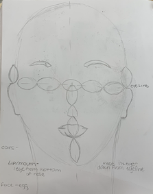
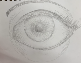
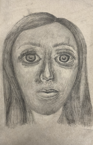
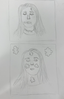
Face Practice Drawings
Face- I learned where exactly to place the features of a face.
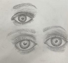
Eyes- I learned how to correctly shape an eye and the correct areas for dark and light shading.
|
|
|
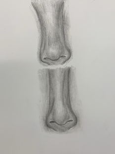
Nose- I learned how to correctly shape a nose and where to add the darkest shading and the lightest areas for highlight.
|
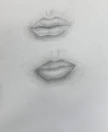
Lips- I learned how to correctly shape lips as well as where the areas of highlight is located.
|
|
|
|
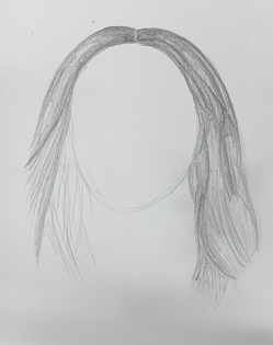
Hair- I learned how to realistically draw hair by drawing in the direction of the hair and adding various values.
|
Whole Face- I took all of the techniques that I learned from drawing faces and combined them all to create a full realistic face.
|
|
|
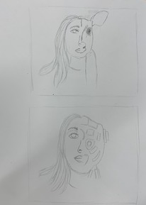
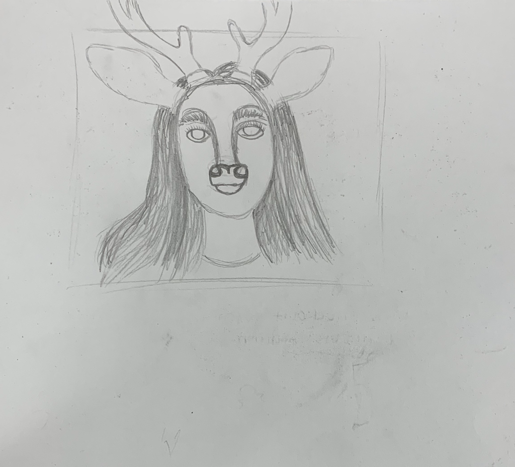
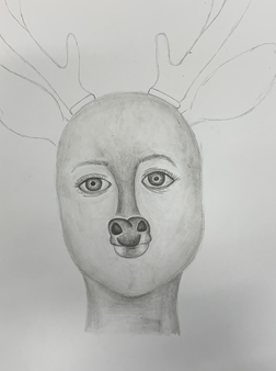
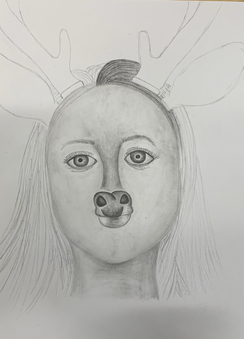
Self Portrait Sketches and Reference Photos
|
|

|
In Progress Photos
|
|
|
Final + Questions
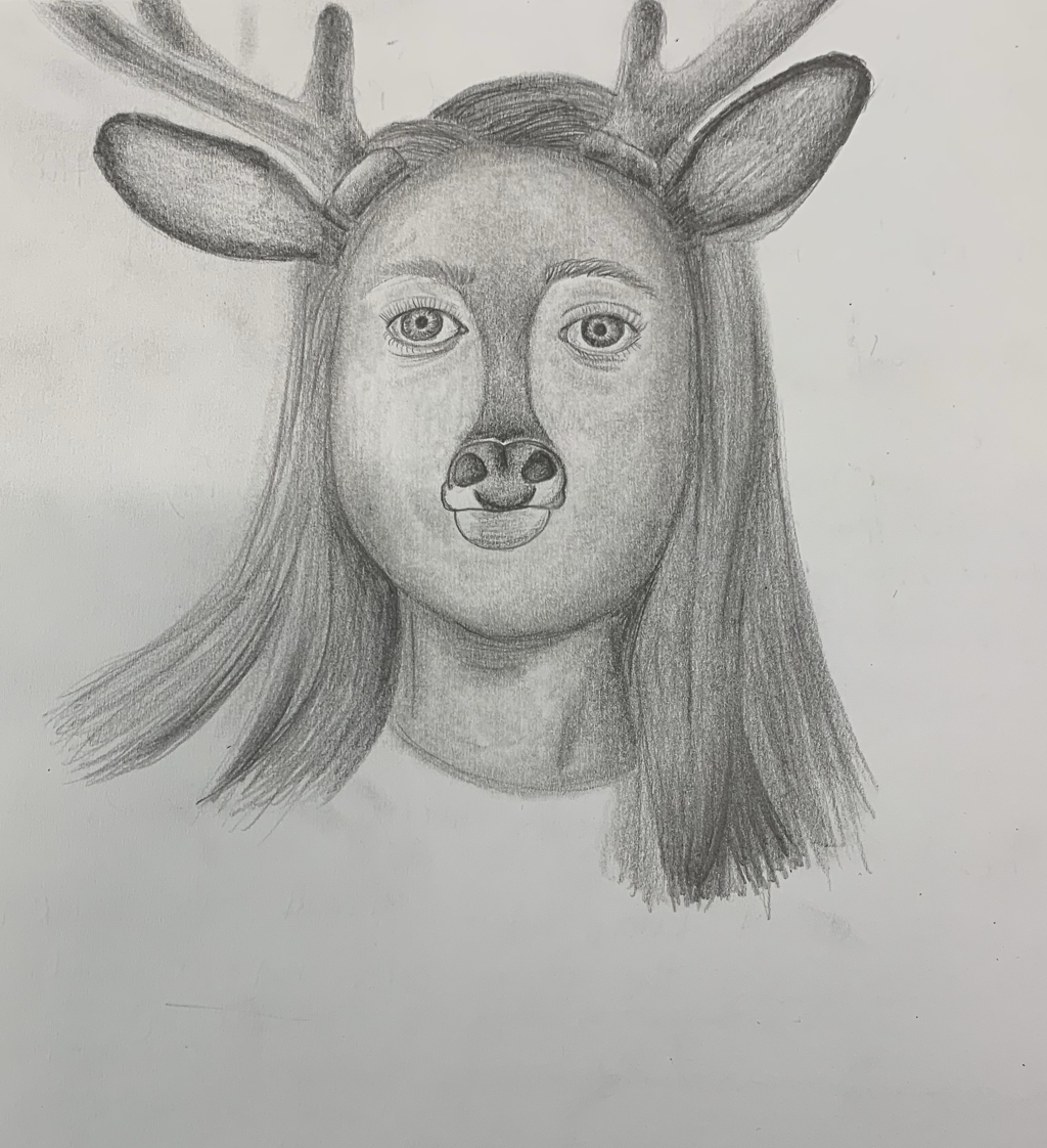
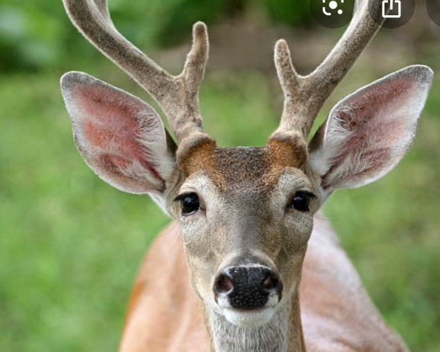
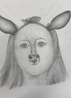
1. The process that I went through when developing my drawing was to figure out where to place the certain features of my face such as my eyes along with the eyebrows and the deer parts. I also had to decide how to morph a deer and myself together. My first sketch started out as myself on one side and the other side being the deer. I then decided to add the antlers, ears, and snout/mouth to myself. I then had to figure out where to place the highlights and shadows since I was just using pencil.
2. The way I found the different values is I took the darker parts of the deer parts, my features, and my shirt and shaded those the darkest. For the lighter areas such as my skin tone and the light streaks in my hair, I shaded very lightly. I made sure that my hair and my shirt was much darker than my skin. I had the features from the deer stand out by making them darker, but also look connected to my self portrait by blending the features into my hair and skin.
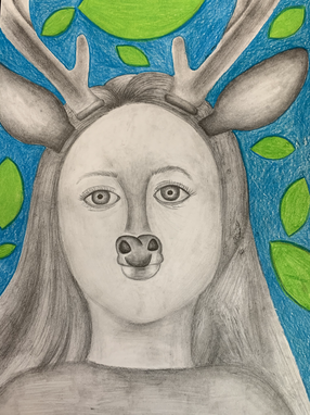
3. I did achieve a full range of different values. I did this by using lighter and more stiffer pencils and along with this, I used softer pencils to create darker areas for contrast. For the skin, I used a very light pencil to create my fair skin color and I used a stump as a blending tool to make the whole drawing look more realistic, smooth, and true to the picture.
4. My artwork is executed and crafted neatly. I used a variety of pencils to create the realistic look and to have a variety of different values throughout the piece. I believe that this piece came out smooth and gives the look of hair as well as the smoothness of skin. The deer's antlers and ears in the reference photos had a smooth look to them so I added a lot of blending to those features. I also darkened the ears and antlers more in the drawing for those features to stand out even more.
5. I was able to capture this look by blending the features of the deer into my self portrait without looking too sharp and out of place. I added many different values throughout the nose area to make the feature look like it's an actual part of my face. I used similar values from my hair on those features for all of the parts of the drawing to come together and look like they all belong.
6. I made sure I had the correct facial feature placement by using the techniques that Ms. Rossi taught me such as how many eye lengths away the different features should be from one another. Along with that, I used the picture taken of me as a reference to see where the different features are exactly located to ensure that the finished drawing will resemble how I really look.
7. It was very important that I learned how to draw the facial features individually. This helped me draw them realistically and along with that, add as much detail as possible. There are different techniques used in each feature as well as a lot of blending. Without learning how to draw each feature individually, the final product would look flatter and not as realistic.
8. The part of the unit that was the most beneficial was the eye. Before this unit, I did not know where to place the pupil of the eye correctly and how to shade in the different parts of the eye to create a realistic look. I also did not know how to correctly draw eyelashes such as where exactly to start the lashes and the different lengths of the lashes needed.
9. An obstacle I had to overcome was the hair. I had a hard time creating the realistic look of hair during the final project as well as following the instructions on the video. I do think the hair turned out better than the practice and shows an accurate texture of hair. Another obstacle I had to overcome was the size of the eyes. During the practice, I drew the eyes way too big and the final product didn't turn out very accurate. I feel on this final project, the eyes are about the correct size and I'm happy with how they turned out.
2. The way I found the different values is I took the darker parts of the deer parts, my features, and my shirt and shaded those the darkest. For the lighter areas such as my skin tone and the light streaks in my hair, I shaded very lightly. I made sure that my hair and my shirt was much darker than my skin. I had the features from the deer stand out by making them darker, but also look connected to my self portrait by blending the features into my hair and skin.
3. I did achieve a full range of different values. I did this by using lighter and more stiffer pencils and along with this, I used softer pencils to create darker areas for contrast. For the skin, I used a very light pencil to create my fair skin color and I used a stump as a blending tool to make the whole drawing look more realistic, smooth, and true to the picture.
4. My artwork is executed and crafted neatly. I used a variety of pencils to create the realistic look and to have a variety of different values throughout the piece. I believe that this piece came out smooth and gives the look of hair as well as the smoothness of skin. The deer's antlers and ears in the reference photos had a smooth look to them so I added a lot of blending to those features. I also darkened the ears and antlers more in the drawing for those features to stand out even more.
5. I was able to capture this look by blending the features of the deer into my self portrait without looking too sharp and out of place. I added many different values throughout the nose area to make the feature look like it's an actual part of my face. I used similar values from my hair on those features for all of the parts of the drawing to come together and look like they all belong.
6. I made sure I had the correct facial feature placement by using the techniques that Ms. Rossi taught me such as how many eye lengths away the different features should be from one another. Along with that, I used the picture taken of me as a reference to see where the different features are exactly located to ensure that the finished drawing will resemble how I really look.
7. It was very important that I learned how to draw the facial features individually. This helped me draw them realistically and along with that, add as much detail as possible. There are different techniques used in each feature as well as a lot of blending. Without learning how to draw each feature individually, the final product would look flatter and not as realistic.
8. The part of the unit that was the most beneficial was the eye. Before this unit, I did not know where to place the pupil of the eye correctly and how to shade in the different parts of the eye to create a realistic look. I also did not know how to correctly draw eyelashes such as where exactly to start the lashes and the different lengths of the lashes needed.
9. An obstacle I had to overcome was the hair. I had a hard time creating the realistic look of hair during the final project as well as following the instructions on the video. I do think the hair turned out better than the practice and shows an accurate texture of hair. Another obstacle I had to overcome was the size of the eyes. During the practice, I drew the eyes way too big and the final product didn't turn out very accurate. I feel on this final project, the eyes are about the correct size and I'm happy with how they turned out.
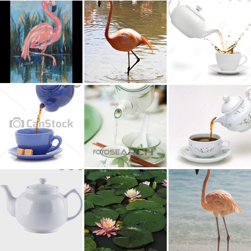
Scratchboard- Sketches and Reference Photos
|
|
|
In Progress Photos
|
|
|
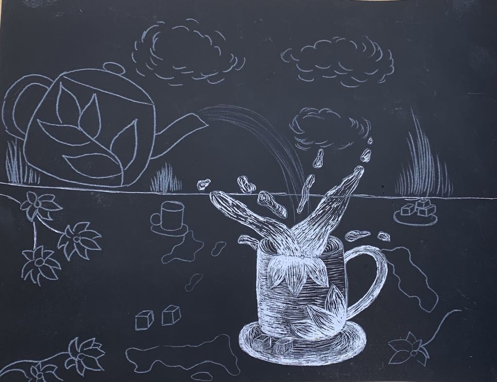
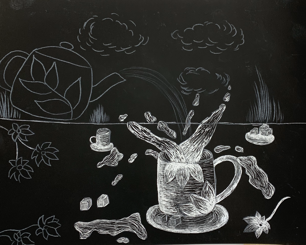
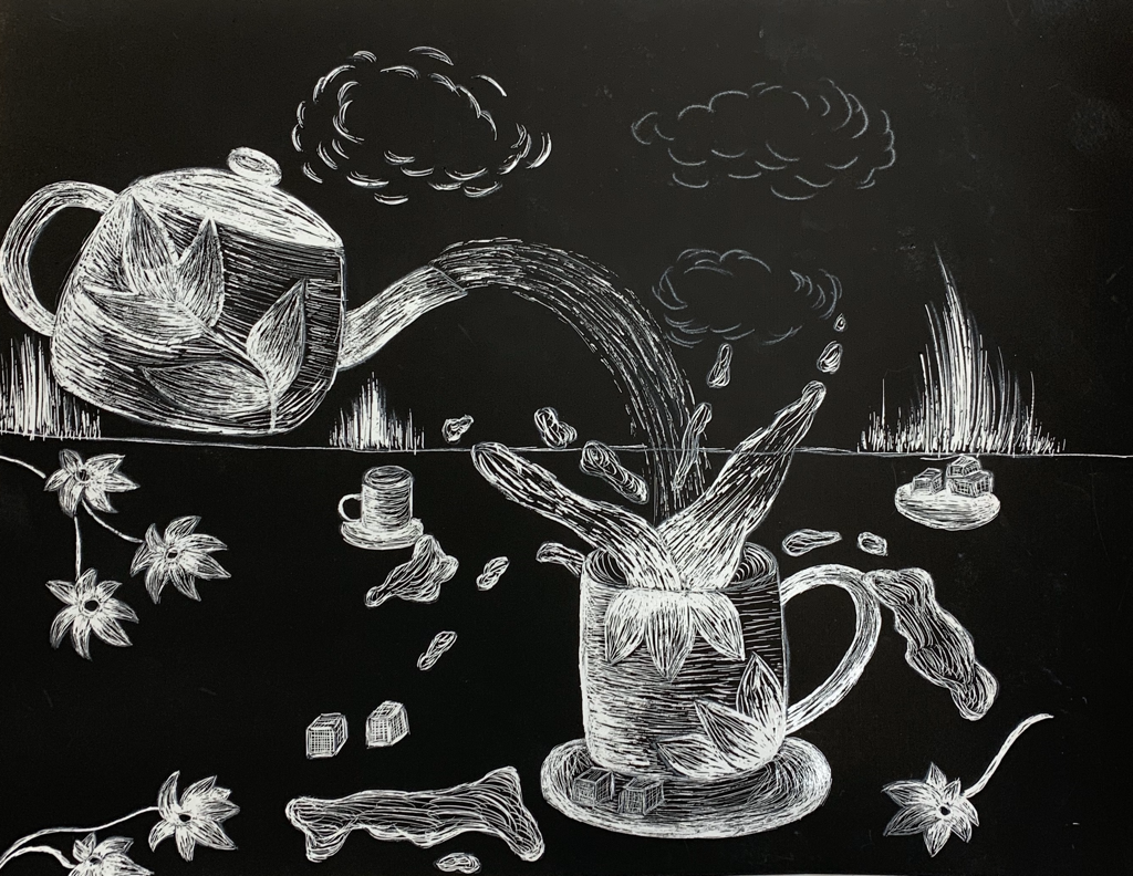
Final + Questions
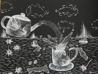
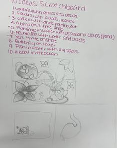
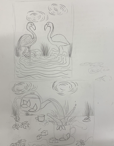
1. The subject matter of this scratchboard piece is the movement of tea at a tea party. The meaning is something that is so peaceful and positive can turn into a bad direction like the tea pouring everywhere.
2. I used texture in this scratchboard project to help round out the objects and for the pieces to look realistic as well as pop. I created highlights and shadows to also create the realistic look. The areas that are lighter for the highlights, I scratched away more of the board, and for the shadows, I scratched away less of the scratchboard.
3. To balance my artwork, I created an even amount of objects throughout the piece. To do so, I added flowers and puddles of tea throughout the bottom of the piece. I had the kettle be on the left side of the piece and on the right side, I put the cup which has tea pouring and overflowing out of it.
4. I applied movement in my scratchboard piece by pouring the tea from the kettle to the cup. I feel that the movement in the piece really helped the scratchboard stand out. Without movement, the piece would look bland and unappealing. The project would also not have much character and have a plain look.
5. I could improve my artwork by adding more movement. I could possibly add more of the pouring effect, more puddles, and possibly more cups with tea in them. I could also make some of the objects bigger to take up more space such as the kettle and the cup. I wasn't sure what other objects to put at the top of the piece, but I could add more clouds to fill up more space.
6. I demonstrated a wide range of shading values by adding highlights and shadows. To create highlights, I scraped off more of the scratchboard. For the shadows, I scraped less of the scratchboard away. For the objects, I didn't scrape away an even amount of the scratchboard for the whole object so they didn't look flat. To help with the objects not looking fat, I also scratched in the direction of the objects.
