Clone Me
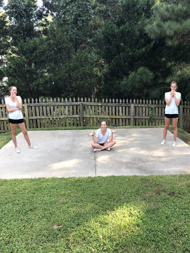
Problems I overcame during this project were aligning the pictures so they matched up to the background properly. With this issue, I then had to erase the background of some pictures to then blend into the background. It was easier to blend with the trees and grass but the cement near my legs and shoes took more time to erase and blend for background. What I would change about my piece is I would add more creative positions for the picture to stand out more. I would also try and overlap two of me to create a more creative and hardier piece to create that can help me become better at photo shop. I would have also possibly added another one of me to create more action happening in the picture.
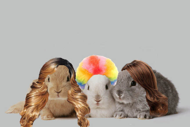
Illustration Friday- Wig
Newanimals
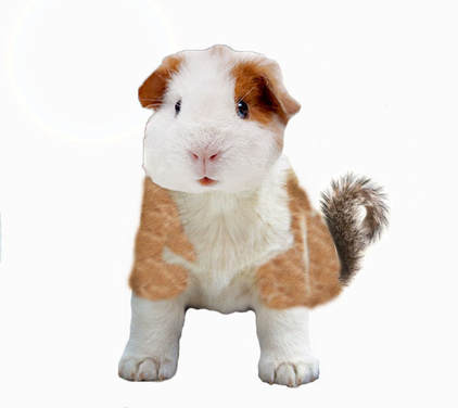
Problems that I have overcame during this project was erasing the background of the photo. I found in the end to just have a white background to better blend the animals and the clone stamp was harder to use with a different background. One thing I would change about this piece is have a background to have this picture stand out more. My animal is a guinea pig, a dog, and squirrel. Has a head of a guinea pig, body of a dog, and a tail of a squirrel. I came up with this idea because I really like dogs and I own a guinea pig. For the squirrel idea I wanted a tail that would possibly have the picture pop more, so I thought of the idea for the tail being of a squirrel.
Illustration Friday- Anonymous

Illustration Friday-Fear
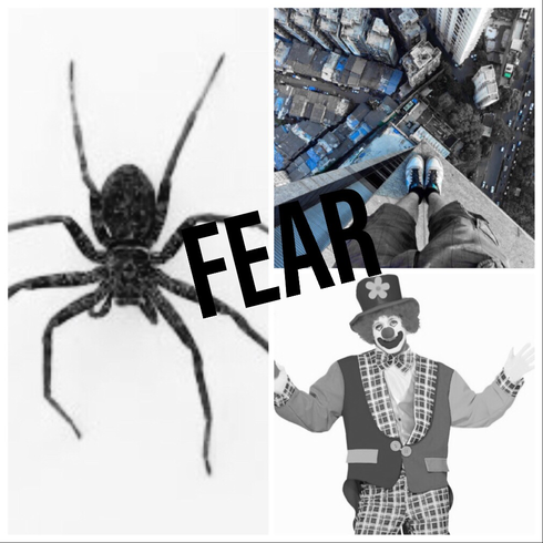
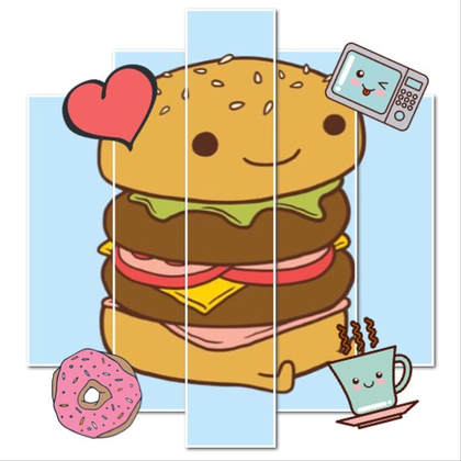
Illustration Friday- Food
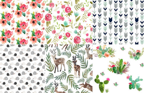
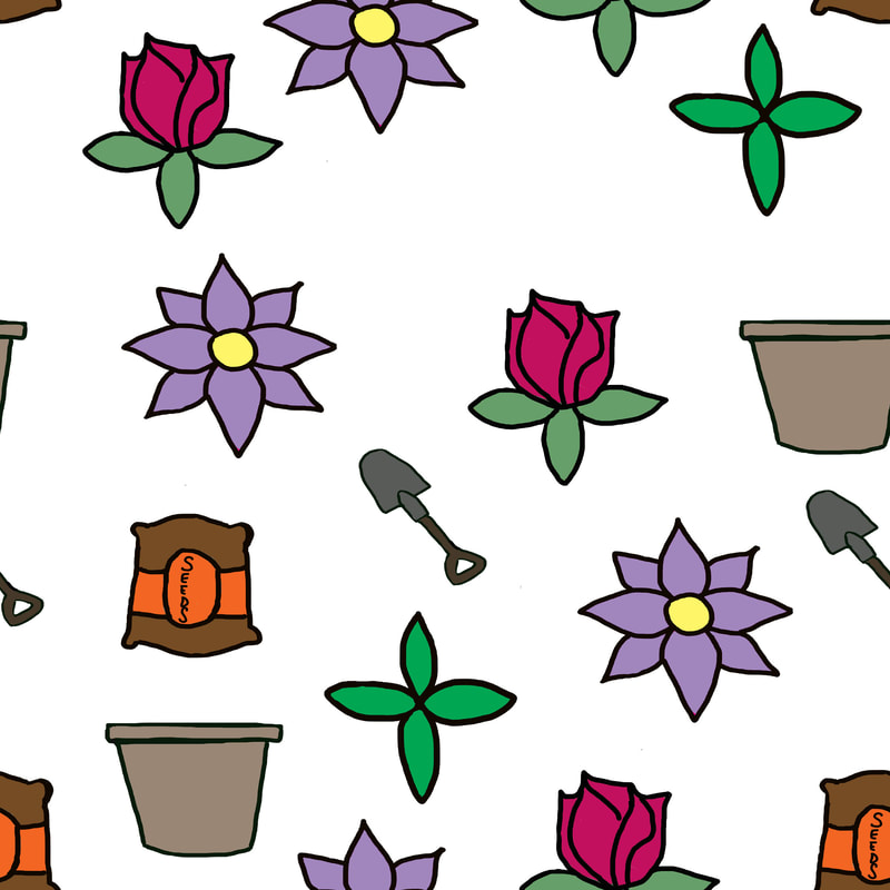
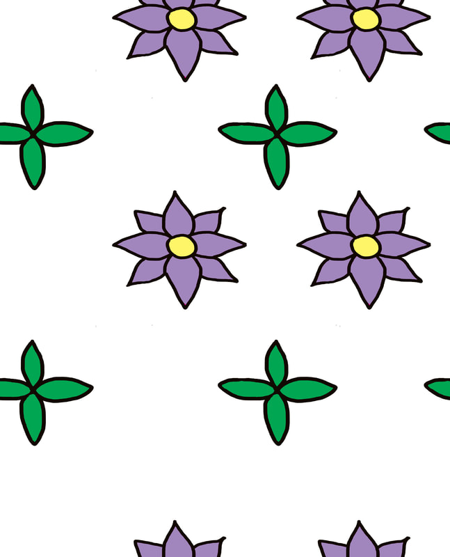
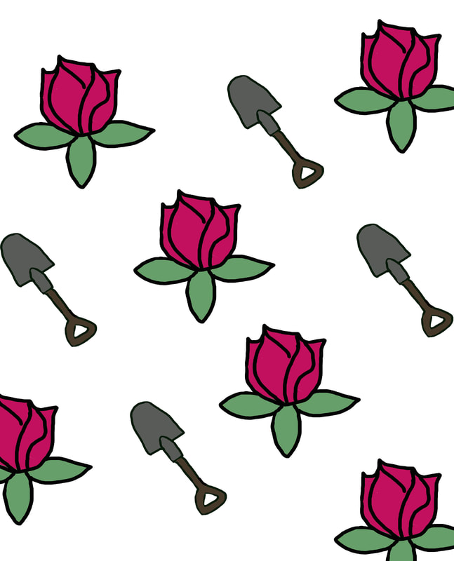
Pattern Inspiration
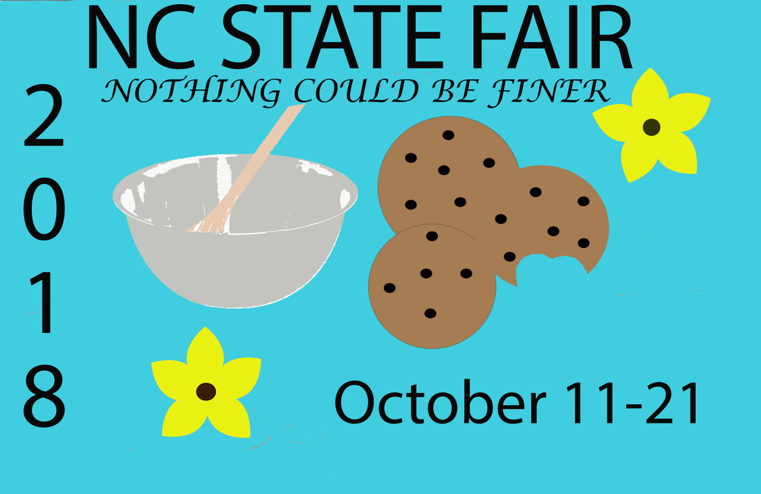
Fair
What I did for the fair project is create a drawing to base off what I wanted to do for the poster. I wanted to base my poster off of the baking competition that takes place. I added all the necessities such as the quote and the date of the fair to the poster. I then added a bowl along with cookies to represent the baking competition. To add a bit more to the poster I then added flowers to fill space and add more color.
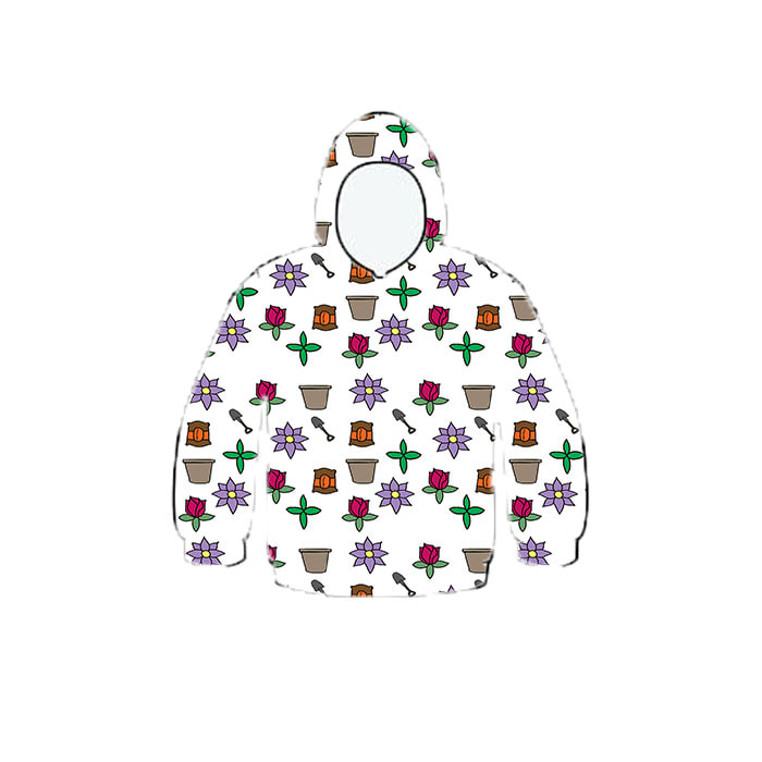
Pattern Project
What was your theme and why did you pick it?
I chose this theme because something I enjoy drawing is flowers so I decided for my pattern to be based of off flowers.
Of the 3 patterns you’ve made, which one is your favorite and why?
My favorite pattern out of the 3 is the one with the leaves and the purple flowers because I like the colors I chose to work with for it and the more similar look of the pattern.
What did you find difficult about this project?
What I found difficult about this project was outlining the parts of the pattern from the drawings I did on paper.
What would you recommend to someone starting this project?
I would recommend trying to keep the pattern symbols more simple for starting off and later on once having more practice, more details can be added.
Illustration Friday- Cat
illustration Friday-Magical
Edible Architecture- Pear
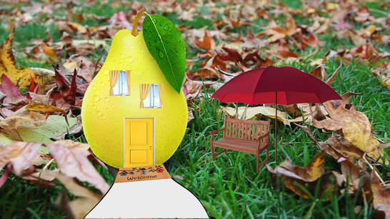
1) Ladybugs live in this house that I created. I decided on the windows and the door to be yellow to help blend into the pear more.
2) Alterations I did to make this look more realistic is to use the burn tool on the edges of the windows and the door to help blend into the pear more.
3) What I would change about this piece is add maybe shutters to help blend windows more. I would also add more detail to the background such as a fence.
illustration Friday- Ghost
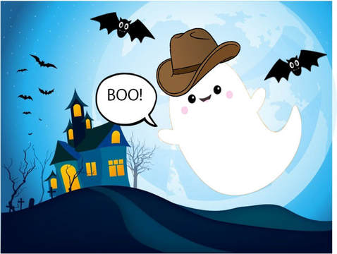
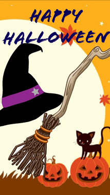
illustration Friday- Witch
Cinemagraph
A book flipping pages
Water dripping
Running up the stairs
turning off and on light switch
Water dripping
Running up the stairs
turning off and on light switch
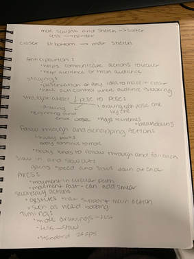
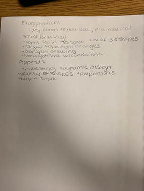
Animation Notes
|
|
stop motion project
For this project my group decided to do a flower that died from a storm that happened and then once sunny a tree grew. Jordyn Nate and I all helped draw parts while I uploaded the pictures onto the app added music and cropped pictures.
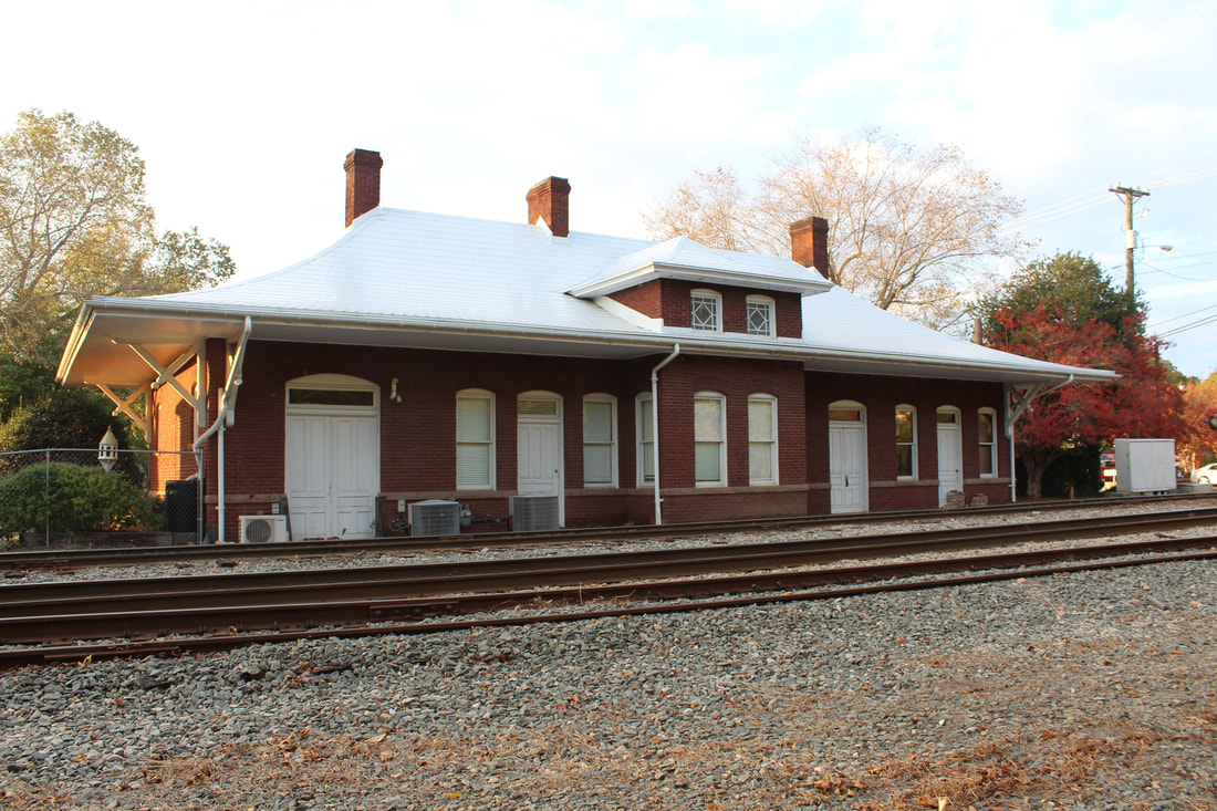
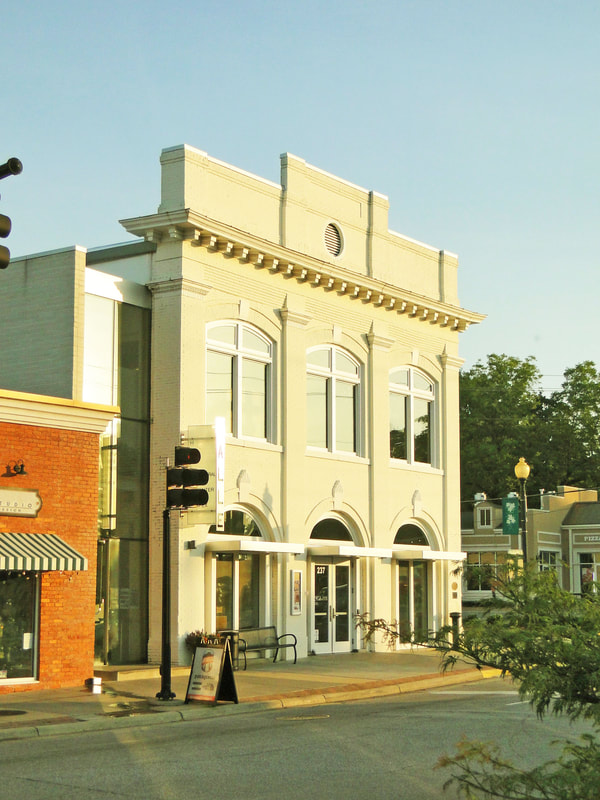
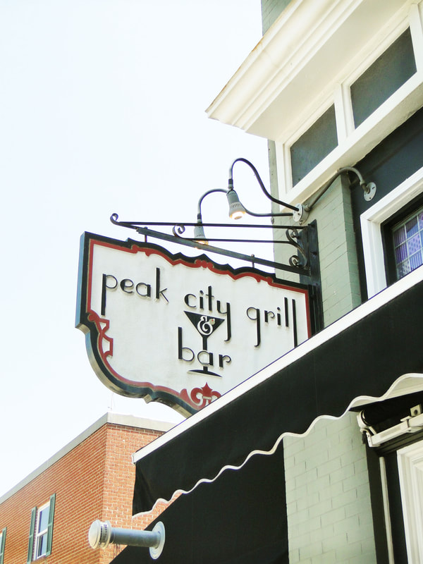
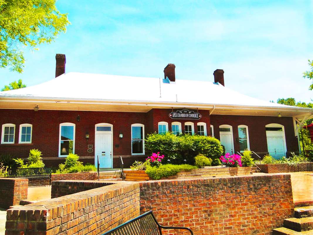
Historical Apex Photos
Original:

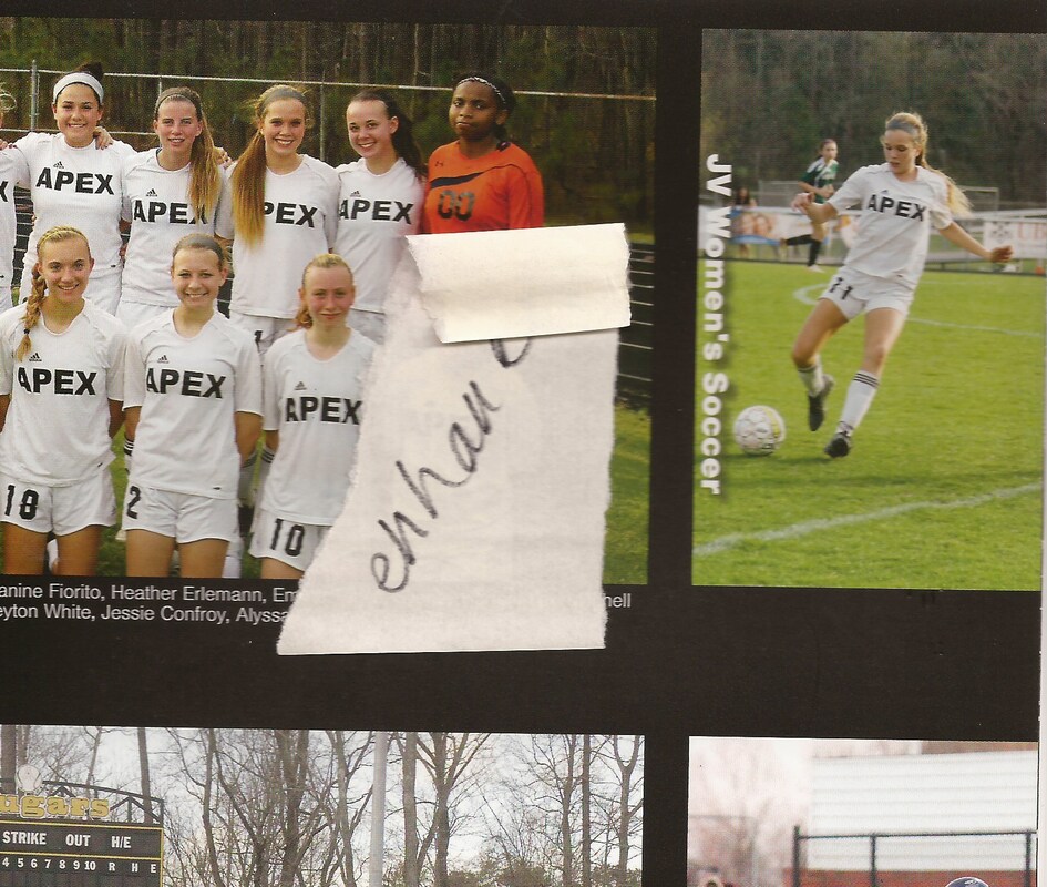
Other picture of original will not upload. Tried several times.
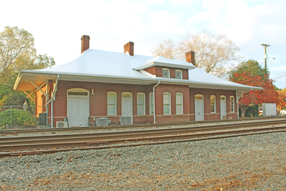
Edited:
|
Colored Picture
|
1) Problems I overcame with this project was for the colored image, finding colors that would look realistic for the picture. I played around with colors to see with would work best.
2) If I could change anything about this piece, it would maybe be to add brighter colors to stand out more and pop.
2) If I could change anything about this piece, it would maybe be to add brighter colors to stand out more and pop.
Water bottle Label
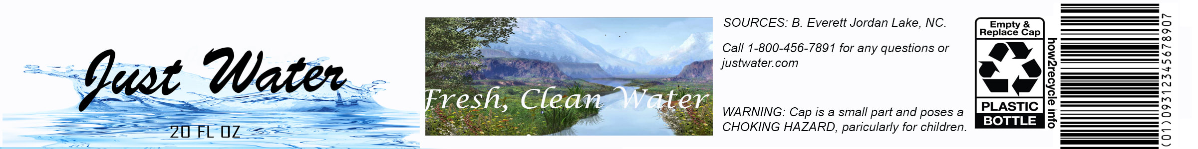
1) The type of product I did was a water bottle label.
2) I designed my piece by measuring out the proportions for the original water bottle label size and then putting details such as a barcode I found online along with other information that was made up to mimic the original.
3) I feel what was most successful was the layout of the piece along with the chosen pictures that go together.
4) Anything I would change about my piece would not be all white for the background and have more detail so that the label would stand out.
