Practice Drawings
|
|
|
|
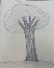
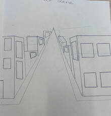
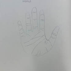
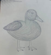
For this practice drawing assignment I was to draw a realistic tree, an animal that had fur/feathers to practice texture, a one point street perspective, and a hand. I tried to create a feathery effect on the bird as well as create textured bark for the tree. For the hand, I tried to draw some of the creases that are in hands to make the image not as bland and more realistic.
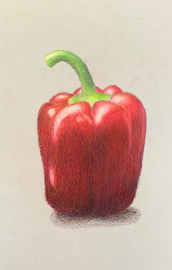
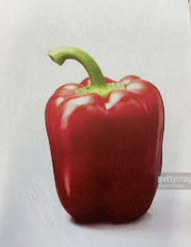
Prisma Color Pepper
|
|
For this assignment, I drew and colored a pepper using prisma colored pencils. To create this, I looked at a picture of a pepper and used various colors such as green, blue, purple, yellow, orange, red, etc. to create a realistic look.
Water color theory- fruit
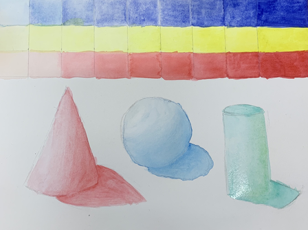
I chose three colors to create three rows going from the left to right (lightest to darkest). To create the darker colors, I added less water and for the lighter colors I added a lot of water. I then shaded three different shapes using those techniques in the rows above.
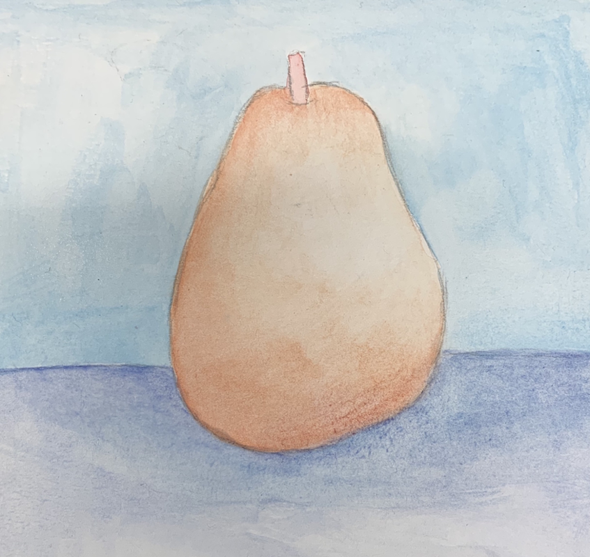
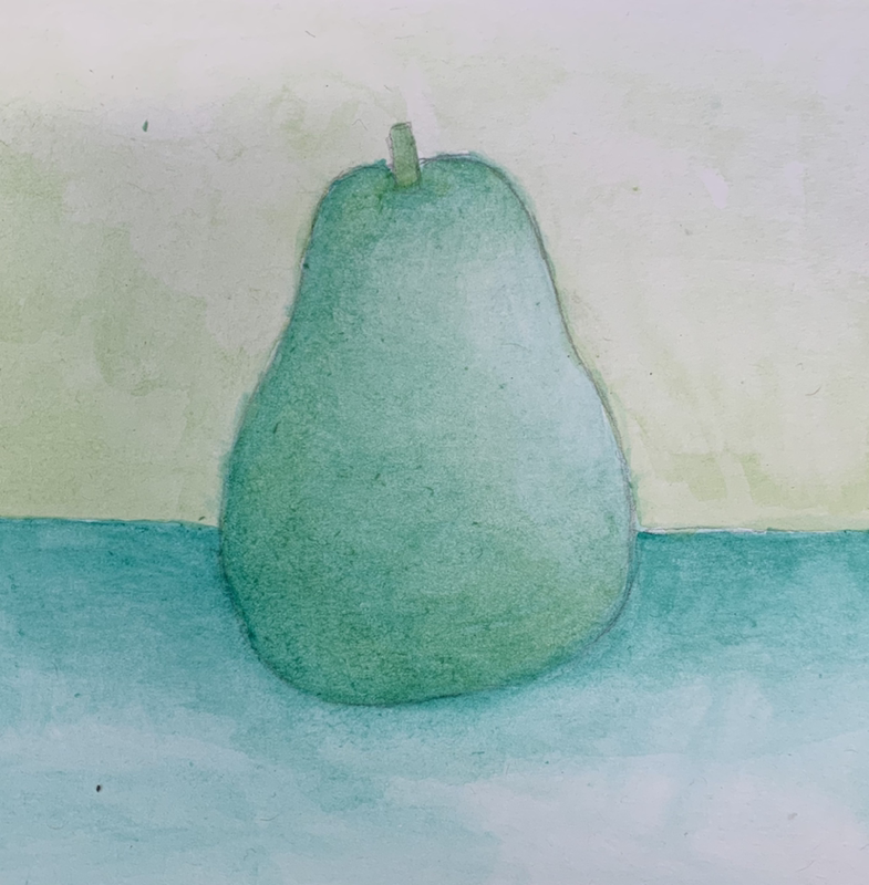
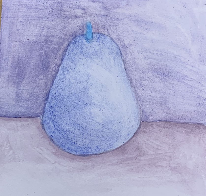
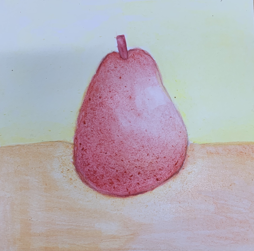
I drew and then watercolored four pears with a background, all in different color choices. What I chose for my color choices were warm colors (red,orange, and yellow) , cool colors (blue and purple) , monochromatic (all green) , and complimentary (blue and orange).
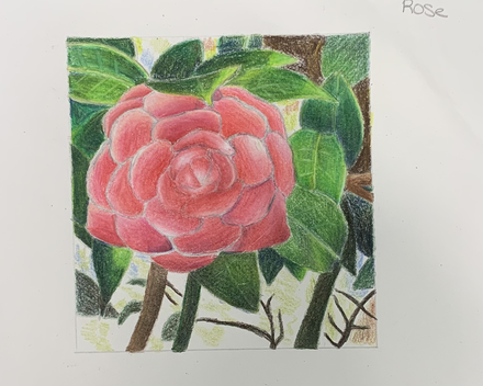
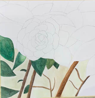
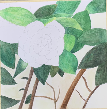
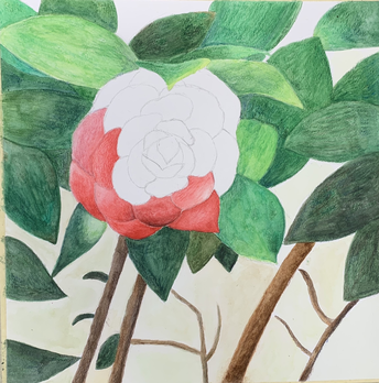
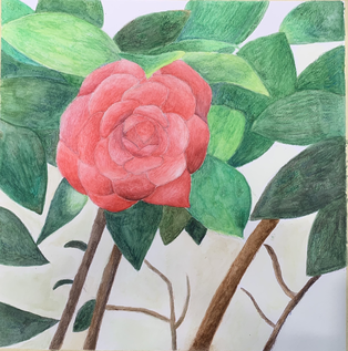
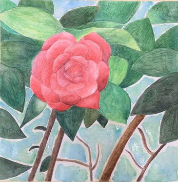
Watercolor Painting: Flower
Reference pictures and color sketch
|
|
In progress pictures
|
|
|
Final
Questions:
1. Water techniques that proved to be effective in my watercolor painting is using watercolor color pencils and blending them by using water. Using watercolor pencils instead of using regular watercolor I found made my painting blend a lot moe. Along with that, I had more control using watercolor pencils. For the background, I used regular watercolor which helped create the soft effect that I was going for.
2. For the background, using transparent layers helped to build the color as well as blend the blues and greens. Using transparent layers on the highlight parts of the leaves helped create the lighter green color without looking too harsh compared to the darker areas. When I used watercolor pencils, transparent layers were hard to do but I did start out with the lighter colors and work my way to the darker ones.
3. The composition was successful because of the flower not being completely centered as well as the leaves not blending too much together. The flower and the leaves I wanted to be the main focus, so I created a very simple and soft background to have the other elements pop. I also added highlights and shading to the flower along with the leaves to look more realistic along with not looking too flat.
4. My color choice I used were greens, pinks, and blues along with a little bit of brown. I painted the flower to be brighter than the leaves so the eyes would move directly to it other than any other parts of the painting. The light blue simplicity of the background helped the painting not be too busy. I painted the leaves brighter than shown in the picture to make the overall watercolor not look too dark.
5. My craftsmanship of this painting was I added watercolor pencils and used water to activate which created a textured look. Unlike others paintings, mine did not come out as smooth and is darker because of my use of watercolor pencils. I also created a simple background unlike others that did something such as a landscape.
6. If I was able to do something different I would add more different colors of greens in the leaves. I would also possibly darken some of the petals a little more. The leaves in my opinion turned out a little darker than expected and would look more eye appealing if the colors were brighter.
7. What I learned about watercolor is to work with light layers and to not add too much watercolor paint at once. The key is to slowly build on top of the painting to create a smooth look instead of a textured one. This semester's watercolor painting compared to mine from last year is much more realistic and has much more color variation. There is much more added detail and I feel I have accomplished creating darks and lights with watercolor.
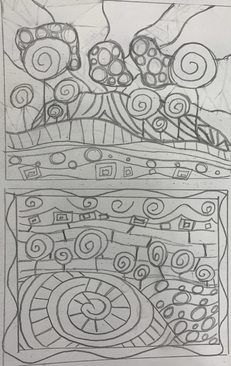
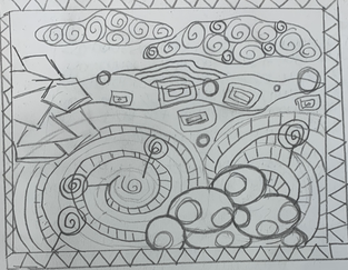
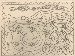
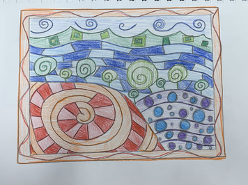
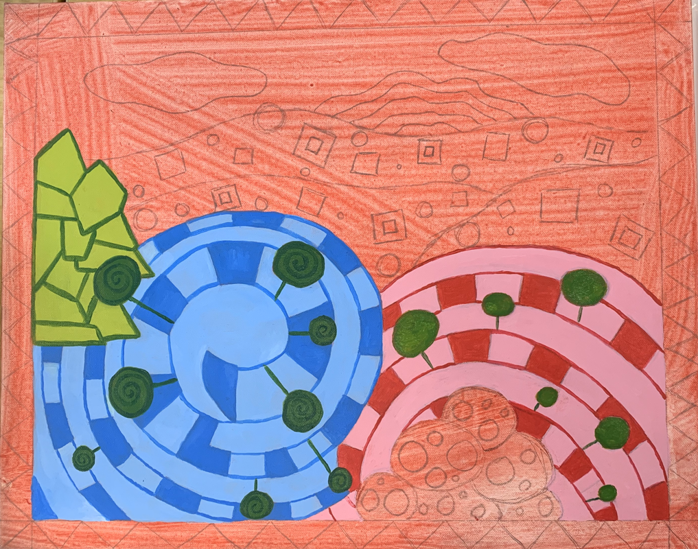
Hundertwasser Painting: Reference Photos and Sketches
|
|
|
|
|
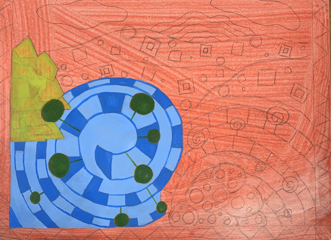
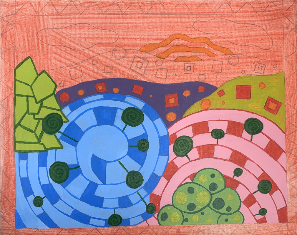
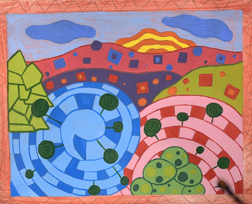
In Progress Photos
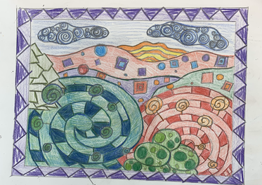
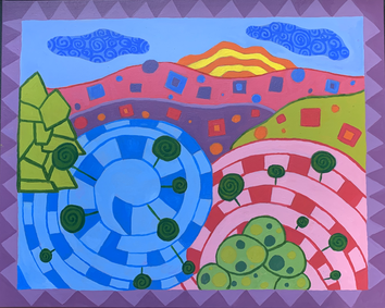
Final
Questions
1. The craftsmanship of my painting is very neat. My colors are a very solid color and you can’t see the red underneath the colors on the canvas. Along with that, the colors are neatly split up and placed throughout the whole painting. My lines and patterns that separate the colors are very smooth.
2. My work embodies Hundertwasser’s style by using random shapes and different sizes of objects in the patterns. His use of lollipop trees are found all around the bottom of my painting. His style also consists of many circles and rectangle shapes of all different sizes which I added on the hills of my painting. Another style that Hundertwasser likes to add in his pieces is swirls. I added many swirls throughout my whole artwork which includes the lollipop trees, the two main hills (blue and red), and in the clouds.
3. My color choices in this painting were bright colors and along with that, colors that complement each other. Hundertwasser is known to use colors together that are complementary to one another. In my painting, I grouped purples and blues (cool colors) together as well as red and oranges (warm colors) . The colors I used I would put in different areas throughout the whole painting instead of one area to repeat many colors. This helped the painting not look too busy or too colorful.
4. The emphasis of my artwork are the two big swirls which are blue and red. They are the objects that take up the most room and along with that, they have the most pattern/detail.
5. My use of textures and patterns helped embellish my artwork by creating a piece that is very appealing to the eye. By adding outlines to the different objects, I was able to nicely and neatly separate the different sections. By doing this, my artwork does not look too complicated and confusing to the viewer.
6. I put a border on my artwork that was a chevron pattern. I also had the border be a darker color than most of the colors used in the main section. This helped the other parts of my painting look brighter and stand out more. I didn't want the border to stand out too much, so I did use purple which was a color used on one of the hills of the design.
7. Difficulties I had during this artwork was having to paint many layers on some parts with certain colors such as yellow. To help with this problem, I mixed white with the different colors which helped me not have to paint as many layers. Another issue I had was once the color I was using dried out, I would have trouble mixing an exact match. In some instances, I had to go over the already painted area with the new mixed color that did not completely match.
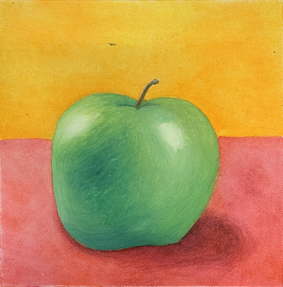
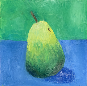
Paint Brush and Palette Knife Practice Oil Paint- Apple and Pear
|
|
For this assignment, I was to paint a fruit with a palette knife and with a paint brush using oil paint. I enjoyed painting with the paint brush but the palette knife I found difficult like last year when I took this class. I do enjoy oil paint because how easy the paint blends together.
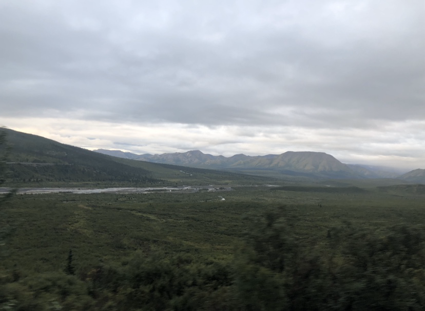
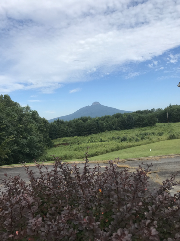
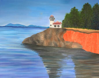
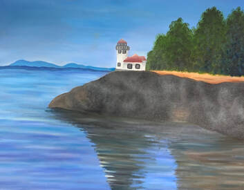
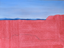
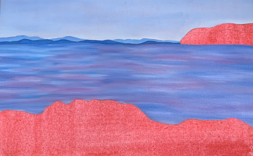
Landscape Oil Painting: Sketches and Reference Photos
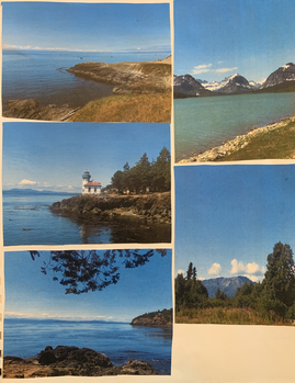
|
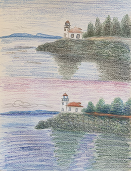
|
In Progress Photos
|
|
|
|
Final
Questions
1. The craftsmanship of my painting is very smooth and neatly painted. The colors in the water as well as in the sky blend in very well and create a sort of ombre effect. Overall, my painting looks very neat and not sloppy. You can tell that I spent a good amount of time working on this painting as well as trying my best to make this look realistic and similar to the picture.
2. My colors that I used in this painting are mostly cool colors with hints of warm tones. For the water, I wanted to blend different colors to make the water more appealing to the eye as well as more realistic. I added different shades of blues, purples, and a hint of light green along with white. For the rocks and shadow that they create, I added many different warm colors such as browns and greens along with cool colors like blues and grays.
3. The way I created contrast in my painting was I used areas that were mainly warm tones and areas that were cool tones. So my painting looked more appealing and warmed up. I added darker and warmer greens into the trees and for the dirt I added warm browns/ yellows. I feel that helped balance my painting and for certain areas to pop more.
4. I created textures in the rocks and trees by stippling my brush so that some of the paint would be raised on the canvas to pop out and look more realistic. I also added highlights in the water and in the shadow to create depth and so the water wouldn't look so flat and bland. Shadows on the rocks helped create dimension in my piece and for that area to not look so two dimensional.
5. The way I was able to create depth was by adding highlights and shadows. I also added texture in many parts to create a more three dimensional look (added depth). For the building, I added dark grays so the building didn't look so flat and unrealistic. Without the added shadows and highlights to the objects in the piece, the whole painting would look flat have no depth.
6. For the water, the painting technique I used is layering different colors so the water wouldn't look flat. I also added colors throughout my whole piece that you may not see when you look at a picture. For example, I added a little bit of green in the water and for the rock's shadows, I added blues, browns, and greens. I also used the stippling technique on the trees and the rocks to create the visual texture.
7. Difficulties I had during this project was creating a realistic shadow from the rocks. I had a hard time picking what colors to use where for this part of the painting as well as what colors to use in certain areas. Things I could do to improve my painting is possibly add more colors to the rocks for that area to look more real and to stand out more.
8. The areas of success that I had with this painting was the water as well as the sky. I feel those two areas look the most like the picture. Compared to my landscape painting from last year, the technique of layering different colors of paint for the water, helped me create a more three dimensional effect. My hardest area to do on my landscape painting from last year was the water, and this years landscape painting, I was able to learn a new way of creating the water that turned out to be very successful.
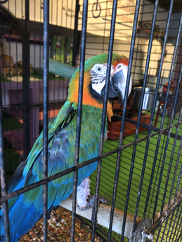
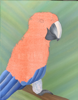
Animal Portrait: Sketches, Practice Fur, and Reference Photo
|
|
|
In Progress Photos
|
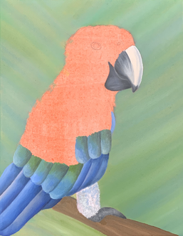
|
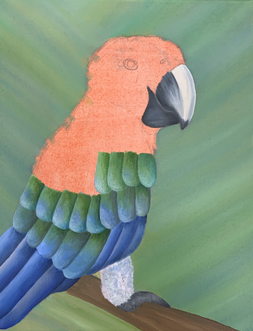
|
|
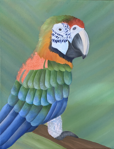
Final + Questions
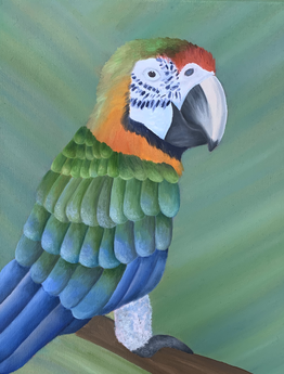
1. This pet portrait I feel was well executed and shows the texture of the feathers throughout the bird. I feel that I transitioned between the different colors in the feathers very smoothly. The feathers also have a realistic look because of my use of shadows and highlights.
2. I was able to create texture by using different brushes to create different brush strokes to accomplish the texture of the feathers. The transition between the blues and greens within the feathers on the main area of the body I feel looks very smooth and no harsh lines. For the feathers located on the head, I used a round brush and flicked the brush on the canvas and along with that I used layering to create a three dimensional texture. Throughout the whole body of the bird, I let a little bit of the red that was painted on the whole canvas, peak through to create a more accurate color.
3. To create this piece, I used many different techniques used in class. The most helpful techniques were learning how to create smooth, clean transition between colors as well as adding highlights and shadows. Last years painting class as well as the practice oil fruits, helped me with highlights and shadows for the realistic look. Another technique I learned was to use colors that you may not think would have to be used.
4. During the practice for the feathers, I had a hard time creating a shadow and highlight on the feathers so the painting would not look so flat. A helpful hint that I learned was to wait until the next day to add the harsh highlights and shadows which helped bring the whole piece together. The feathers on the final painting compared to the practice I feel turned out a lot better and more realistic/ accurate to the picture.
5. The craftsmanship of my painting is very detailed and well blended. Compared to my pet portrait from last year, I used many different colors throughout and I added much more highlights and shadows. I feel that this painting compared to last years is more appealing to the eye. I carefully blended the colors but was able to not overblend and make it muddy. An issue I have is over blending sometimes and I think for this project I blended the perfect amount.
Glass Painting Practice
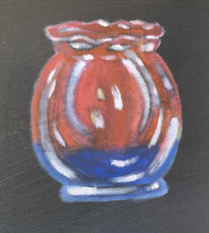
For this assignment, I practiced painting glass objects by painting the highlights located on the objects along with blues, reds, and yellows for the background.
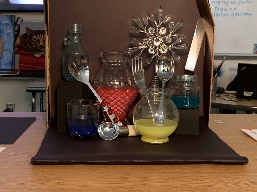
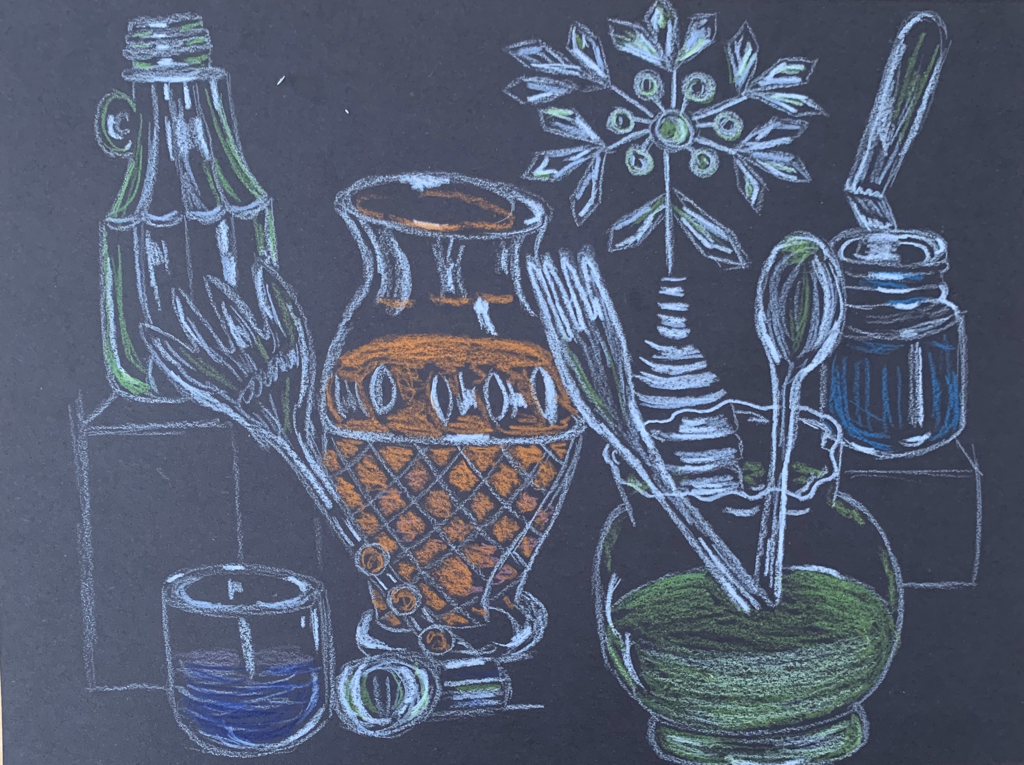
Glass Painting Sketches and Reference Photo
|
|
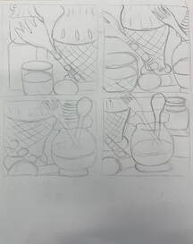
|
In Progress Photos
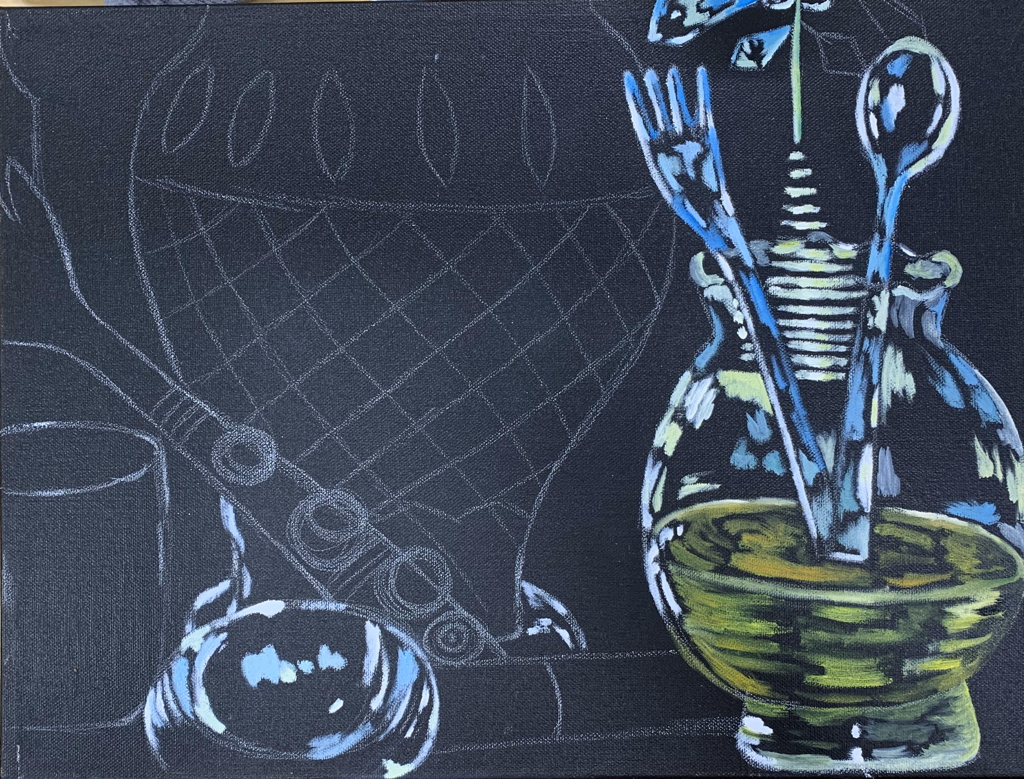
|
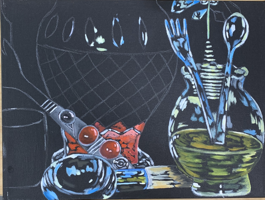
|
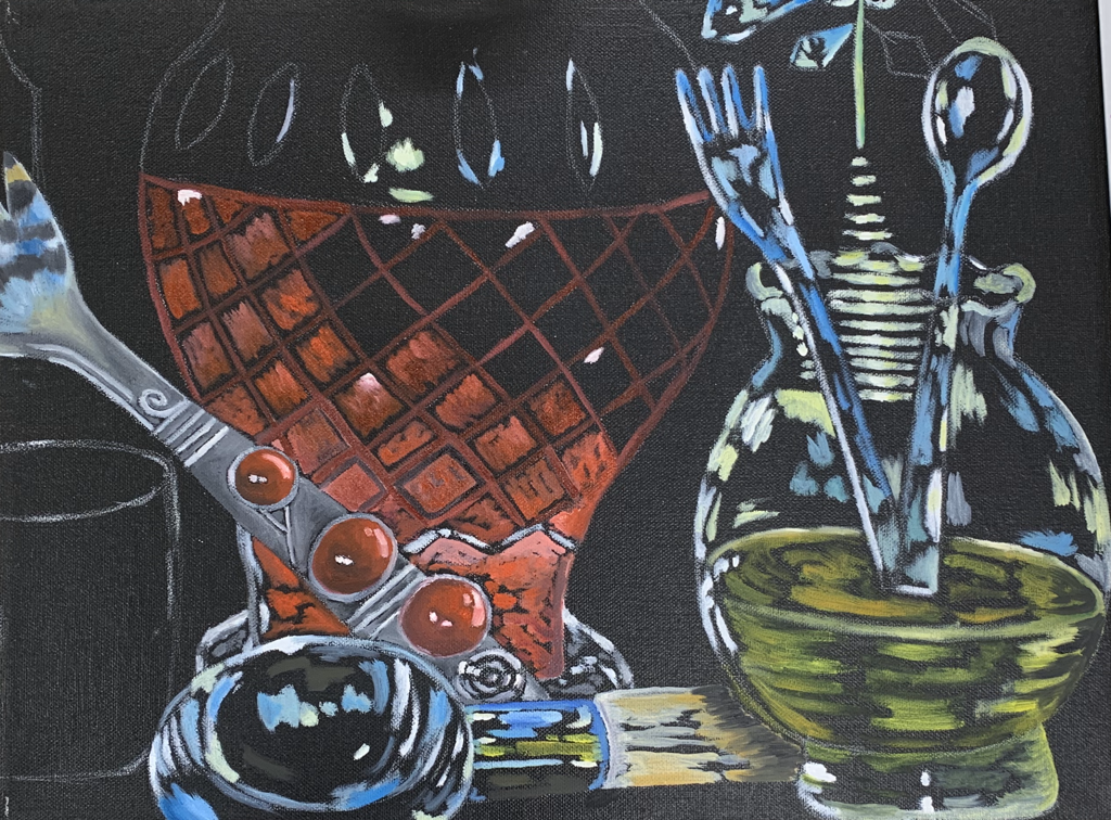
|
Final + Questions
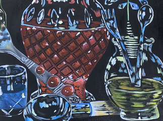
I found this assignment both difficult and enjoyable. Before this assignment, I never tried to paint glass. I do feel that this assignment turned out really good. I love the pops of different color throughout the whole piece. I learned that for painting glass, you need to paint the highlight parts of the objects, and then fill in the other colors that you see. My favorite part of this piece is the fork and the spoon that lays at the bottom. I love how the different pieces in the painting pop. The most realistic part of the painting I think is the fork. I am very happy with how the silver as well as the red button pieces turned out. I did have a hard time figuring out where exactly to place the added colors to give a realistic effect. Even if the piece doesn't look very realistic, I am proud of how it turned out and painting this piece taught me new techniques of painting that I did not know before.
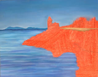
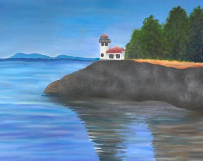
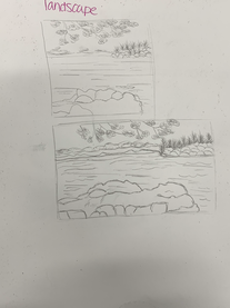
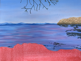
Original Painting Sketches- Landscape
In Progress Photos
|
|
|
Final
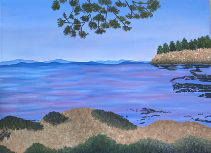
For this project, we were able to paint anything that we wanted but had to come up with a realistic idea that was challenging and could show off our painting techniques. My favorite medium to work with in painting is oil paint. I find it the easiest to work with because it's easy to blend and doesn't dry as fast as acrylic. I enjoyed painting the landscape in oil earlier in this class and last year when I took painting, so I decided to paint another landscape. I think this is my best landscape out of the three because the land and water looks the most realistic. Comparing this painting to last years landscape painting, I think I have improved with working in oil. I really enjoyed creating this piece and was my favorite ones to paint in this class.
