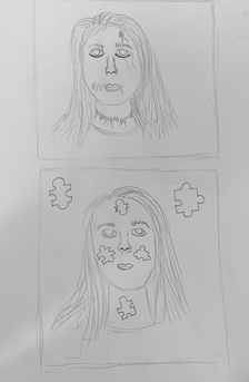
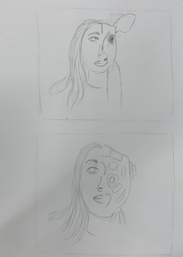
Assessment Drawings
Animal, Face, 2 Point Perspective, Flower
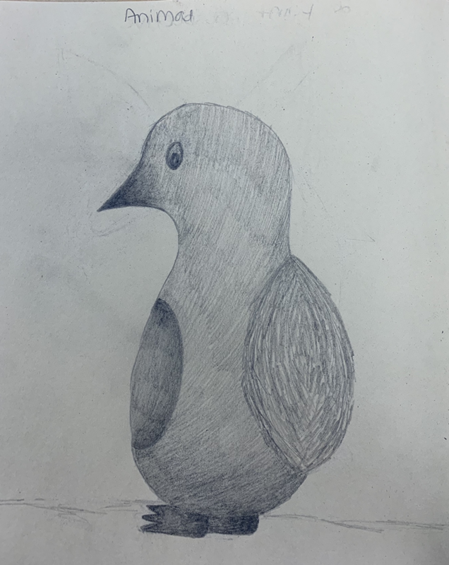
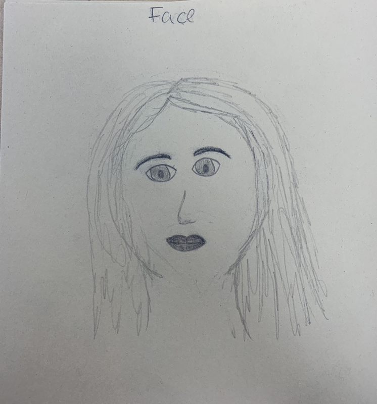
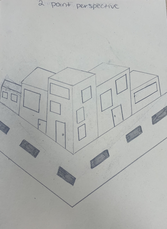
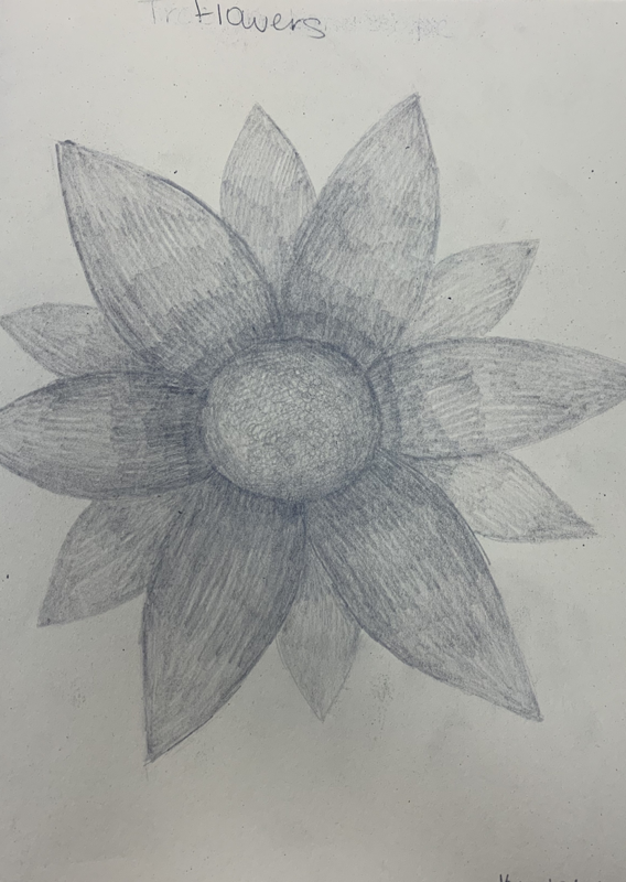
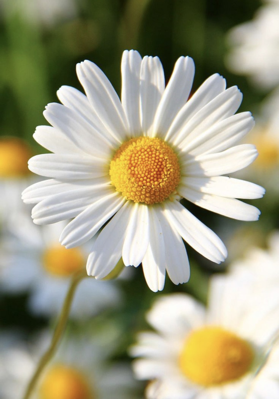
For the assessment drawings, I was assigned to draw a flower, an animal, a face, and a 2 point perspective. I have already done an assessment drawing assignment for painting so I had a couple different drawing assignments than the class. I found the flower along with the 2 point perspective to be the more fun and easier to draw out of them. I don’t have much experience with drawing faces and I find I’m not very good at drawing when I’m going off on the top of the head without sketches or reference photos to go off of.
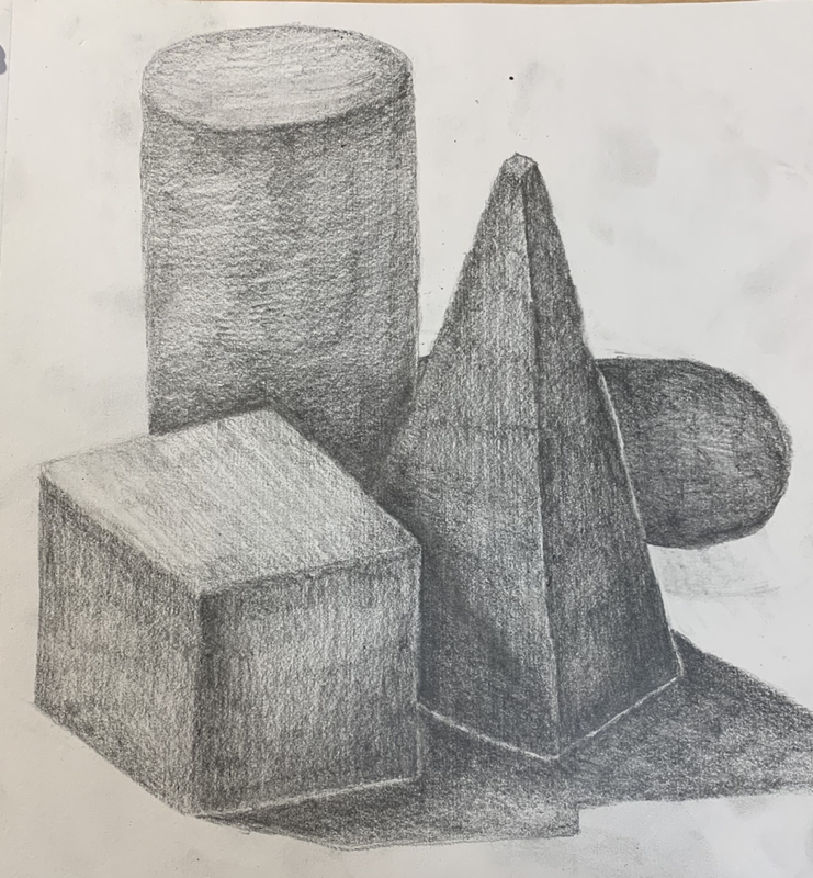
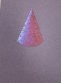
Shape Shading with Light Source
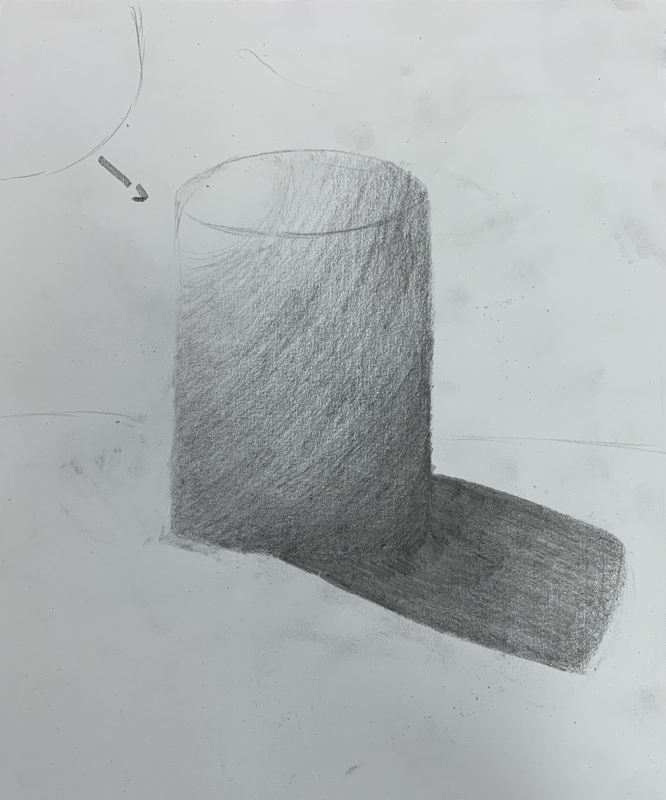
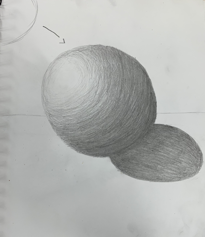
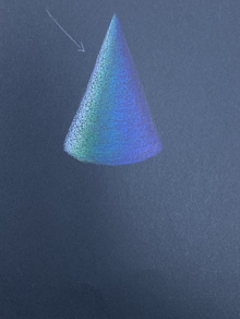
For this assignment, we were to do 4 different shapes that were told to do which are a sphere, cube, cone, and cylinder. The top where the light source is pointing to is the lightest and the darkest shaded part is the part with the least light touching the shape along with the shadow the shape creates. If the sun is located on the right side, the shadow would be going towards the left and as well as the other way around.
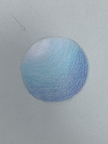
practice shaded shapes- pencil and prisma color
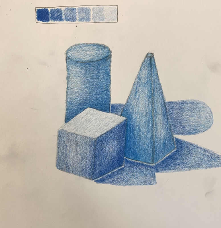
This practice assignment was to share shapes that we looked at with dark to light shading. For the colored pencil, I used a dark blue along with a lighter one to create the highlights and shading of the shadows and the shapes of the light reflecting onto them. I found the color pencil/ prisma color to be easier to build up and create the more realistic look than the regular pencil.
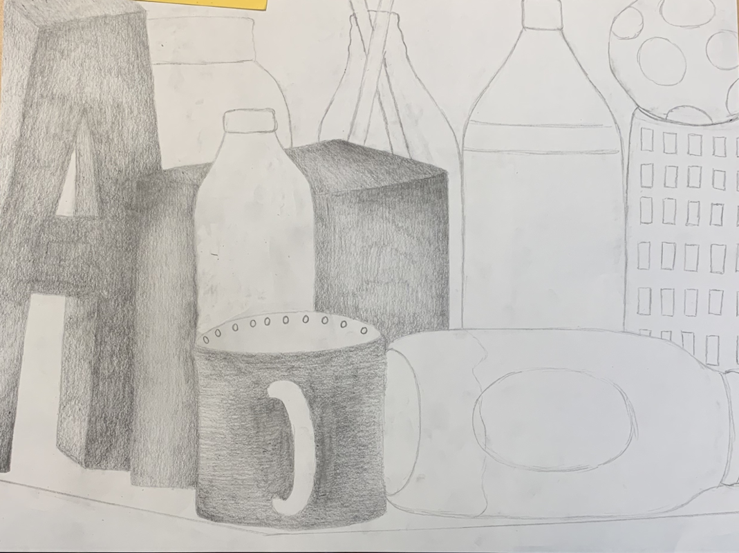
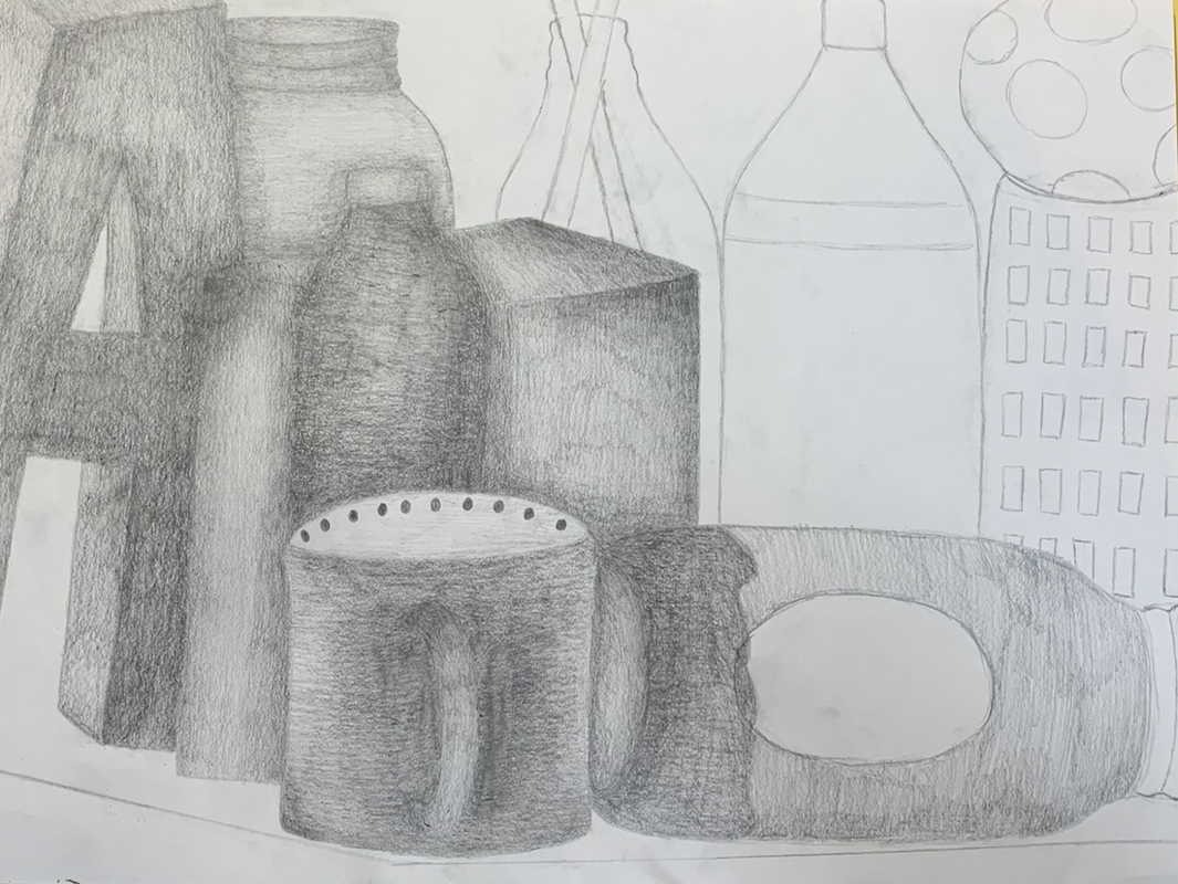
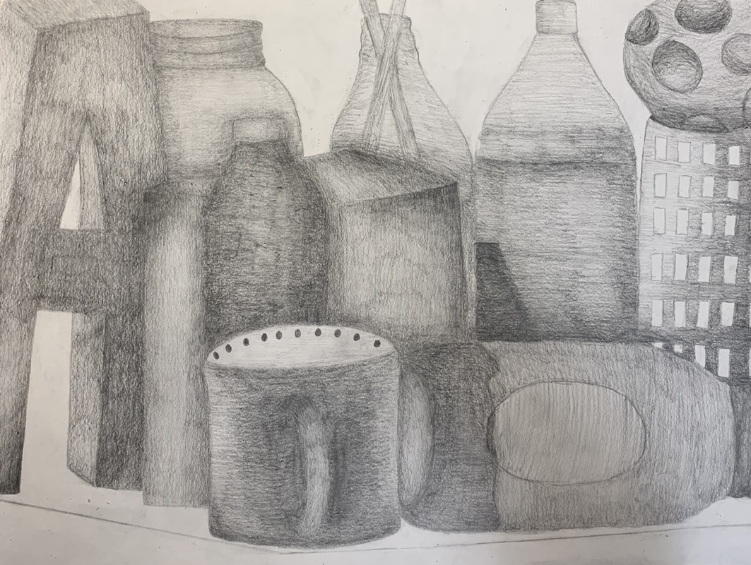
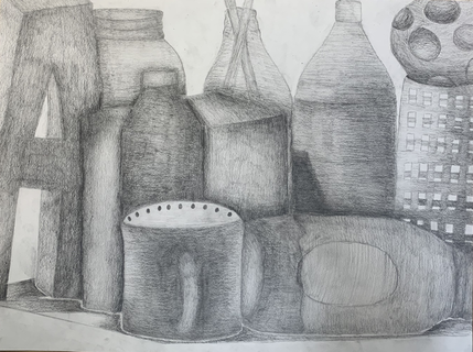
Still Life Pencil Drawing With Value
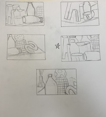
Still Life Sketches
Still Life In Progress Photos
Final Still Life
Critique Questions
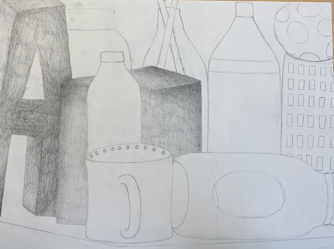
1) The way I arranged my composition was from where I am sitting which is how everything is faced. I had the items not face as much of an angle and straightened up the table a little more. This was a successful composition because I had items overlapping the other behind one another and created highlights along with dark shadow to show items overlapping the other. Along with that, I added shadow from the items on the table.
2) I did use a light shade of values from me shading very lightly on items with white along with the glass and I used dark shades for the shadows and colored areas. This helps bring the items out and realistic and as well shows where the light was hitting each item.
3) Practice helped with this piece by learning which pencils to use for what and which helps for lighter and darker shading. The practice also helped me to blend my lines together and not make as visible pencil lines. Along with that, I learned to shade with the shape to make the item look more 3 dimensional and not flat which I think helped this project the most.
4) The blending in my objects are dark to light transitions between each value. I used circular motions with my pencil to help the shading look smoother and no as much as pencils along with shading with the shape. I started out shading very lightly and then afterwards added to shadows which required more pressure with the pencil.
5) The texture is essential in this look by creating smooth transitions between the values to show how smooth and flat the objects are. The texture helps bring out the realistic effect of the object like for the ball there were bumpy indentations of holes and the shading was darker in the indentations to show the not so smooth but bumpy texture of the object.
6) If I could recreate my piece I would possibly shade lighter on the lighter areas of objects such as the mason jars along with the caps on the bottles. Using a harder pencil and not as soft would help create the lighter look of the objects with the highlights from the light shining.
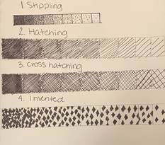
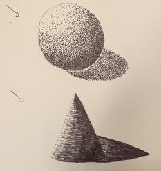
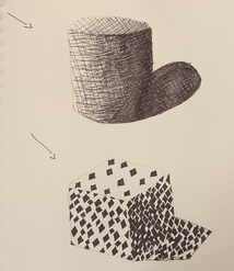
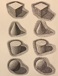
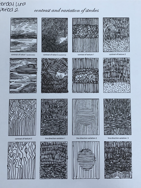
Pen Technique Practice With Scale and Shapes + Stippling Worksheet
|
|
|
|
For this practice assignment, I was to do a value scale for different pen techniques which are stippling, hatching, cross hatching, and an invented one I create myself. The scale goes from dark to light. I then used what I learned from the scales to use the different techniques on a cube, cylinder, sphere, and cone. For the next assignment, I was to use the stippling technique on all four of those shapes by mimicking the already created shapes made by stippling on the left.
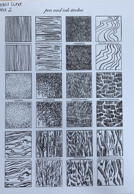
Pen and Ink Strokes
|
|
This is a practice assignment practicing different ink patterns as well as combining different patterns into one. This also helped me practice different pressures with ink.
|
Pen and Ink Textures
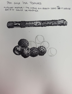
We were to watch two videos going through the steps of making textures realistic along with focusing on where the light source is on the textures.
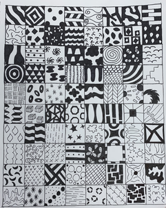
100 Ink Textures
|
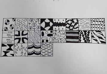
|
For this assignment, I was to create 100 different textures that I could use on different assignments with a variety of ones that are dark to light. Some textures are simple while others are more detailed. I found the assignment to be the easiest in the beginning but the further I got into the assignment, the more difficult it became and the more creative I needed to be with my textures.
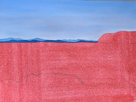
Landscape with Patterns and Designs
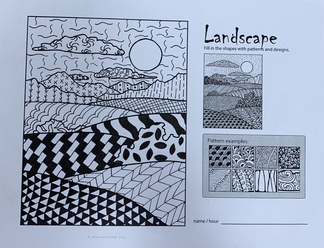
For the landscape I used some of the patterns from my 100 textures. I learned to curve the patterns to the shape of the object for example the hills. I used a range of dark and light textures throughout the assignment.
Shapes with Patterns
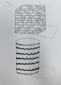
For the shapes I used two patterns from my 100 textures and I learned to curve the texture for how the shape is. I used a brick- like design on the square and for the cylinder I used a wave-like design.
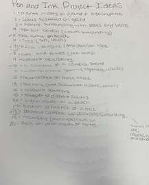
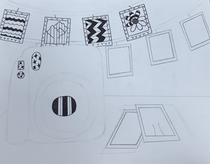
Pen and Pattern Project: Sketches and 20 Ideas
|
|
|
Pen and Pattern Reference Photos
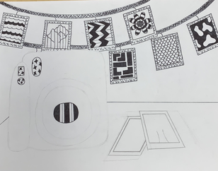
Pen and Pattern Final Sketch
Pen and Pattern Project: In Progress
|
|
|
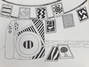
Pen and Ink Project Final
Critique Questions
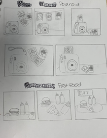
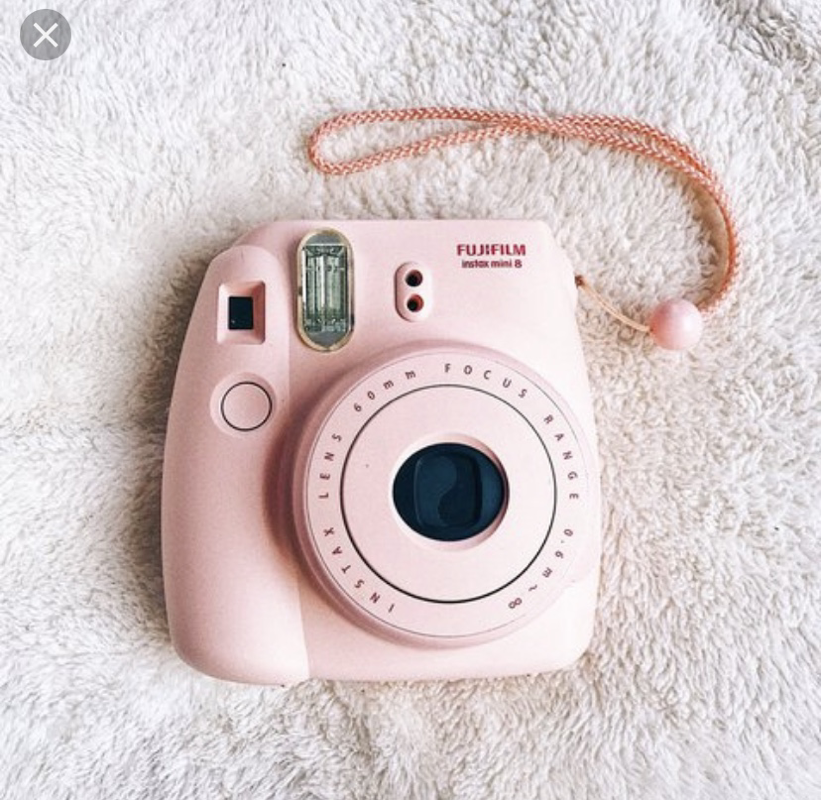
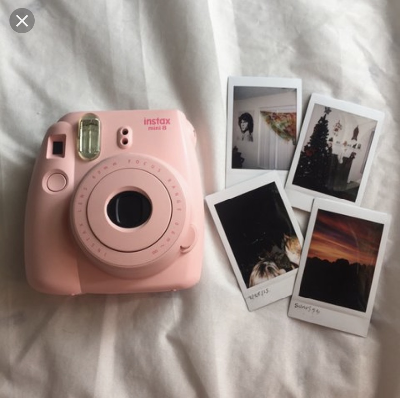
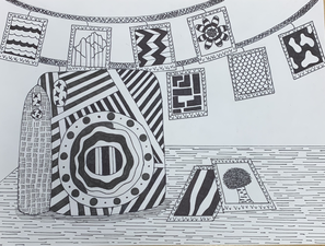
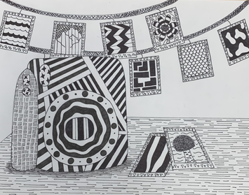
1) I arranged my composition by placing the camera more on the left side and not in the middle and having the polaroids on the table as well as in the background. I have the polaroids all throughout the background and having a couple laying on the table and not right in the middle but more on the right of the drawing.
2) Texture and Pattern is important in my composition by showing depth along with shadow and well as different pieces in the drawing. For the camera, I made the pattern darker and created more lines near the bottom to create a shadow effect. For the polaroids I put different patterns in each. With all of the patterns I used in the polaroids, table, and camera, I decided to keep the wall or background blank to not make the drawing too overwhelming.
3) Value is so important in this project because it creates depth and shadow. On the strings holding up the polaroids, the further the string going off the page I made the string darker. I also created a darker value under the camera to create shadow and make the picture not look as flat and more dimensional.
4) The craftsmanship of this project are many patterns throughout because of me using a different pattern or picture for each Polaroid. I made the pattern of the camera much darker to make it stand out the most out of the picture. Since the camera was so dark, I made the table have a lighter value so it would not take away from the camera.
5) From practicing patterns, I learned how to create different values to make my piece more dimensional and not as flat. I also learned by adding more of the pattern I’m able to create shadow and show how close or how far the object is in the drawing. I was also able to come up with different patterns on the 100 pattern assignment to use in my final piece to make it more original and creative.
6) When applying the pen and ink patterns it’s important to understand the concepts to be able to not make your artwork flat and be more dimensional my adding more of the pattern or less. It’s also important to know how to shape the pattern depending on your object in your drawing. An examples is the camera lens on my camera I shaped the pattern into a circle to follow the piece of the camera.
7) I believe what I learned in this pen and ink project I did learn how to do better on future projects by learning how to use patterns and shape them depending on the object. This can help in painting and drawing which are future assignments and possible classes I may take in the future. This assignment also helped with value and creating dimension to my piece that I can use on future projects.
8) If I could recreate my piece things I would do differently is possibly make the pieces of the pattern smaller to add more of the pattern on the objects such as on the polaroids. I would also add a different pattern on the edges of the polaroids than the triangles just because I’m not a huge fan of that pattern. I would also possibly do a different pattern on the strings that hold up the polaroids.
Prisma Color Shapes
|
|
|
For prisma colored pencils, I practiced how to layer and blend the colors to make a clean transition without any harsh lines indicating a color change. I practiced this on a sphere along with two cones. I found the cone being the easiest to transition the colors and have them blend well.
Prisma Color Fruit- Apple
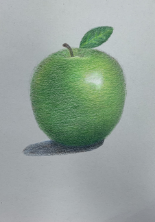
With prisma colored pencils, I learned how to realistically color and draw an apple. I found the colors I used to be a range of greens, yellows, browns, and a little bit of blue. From the practice assignments, I learned to color with the shape to make the picture realistic and not flat.
Pastels Practice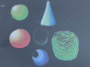
For pastels, I learned how to properly blend colors to create a clean transition between colors and no harsh lines showing a color change. I found the medium to be messy and harder to control unlike prisma colored pencils.
|
Pastels Apple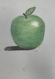
For the pastel apple, I decided to use the pastel prisma colored pencils because I found creating the color I needed to be easier as well as easier to control. The pastel pencils were easier to blend and not messy.
|
Watercolor pencil Practice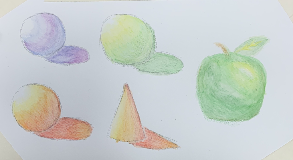
For the watercolor pencil practice, I found the blending and transitioning of the colors to be successful as well as creating shadow. Using the actual colored pencils I did not find a challenge considering the water does the blending. I had to be careful and not use too much water or there would be grouping on the shapes caused by the water.
|
watercolor pencil fruit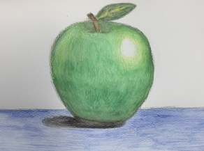
The watercolor pencil apple I thought was difficult in getting all the colors I needed for the fruit. I had difficulty in laying colors because once the water was added, I had trouble keeping the blue and the yellow without it being covered by the green.
|
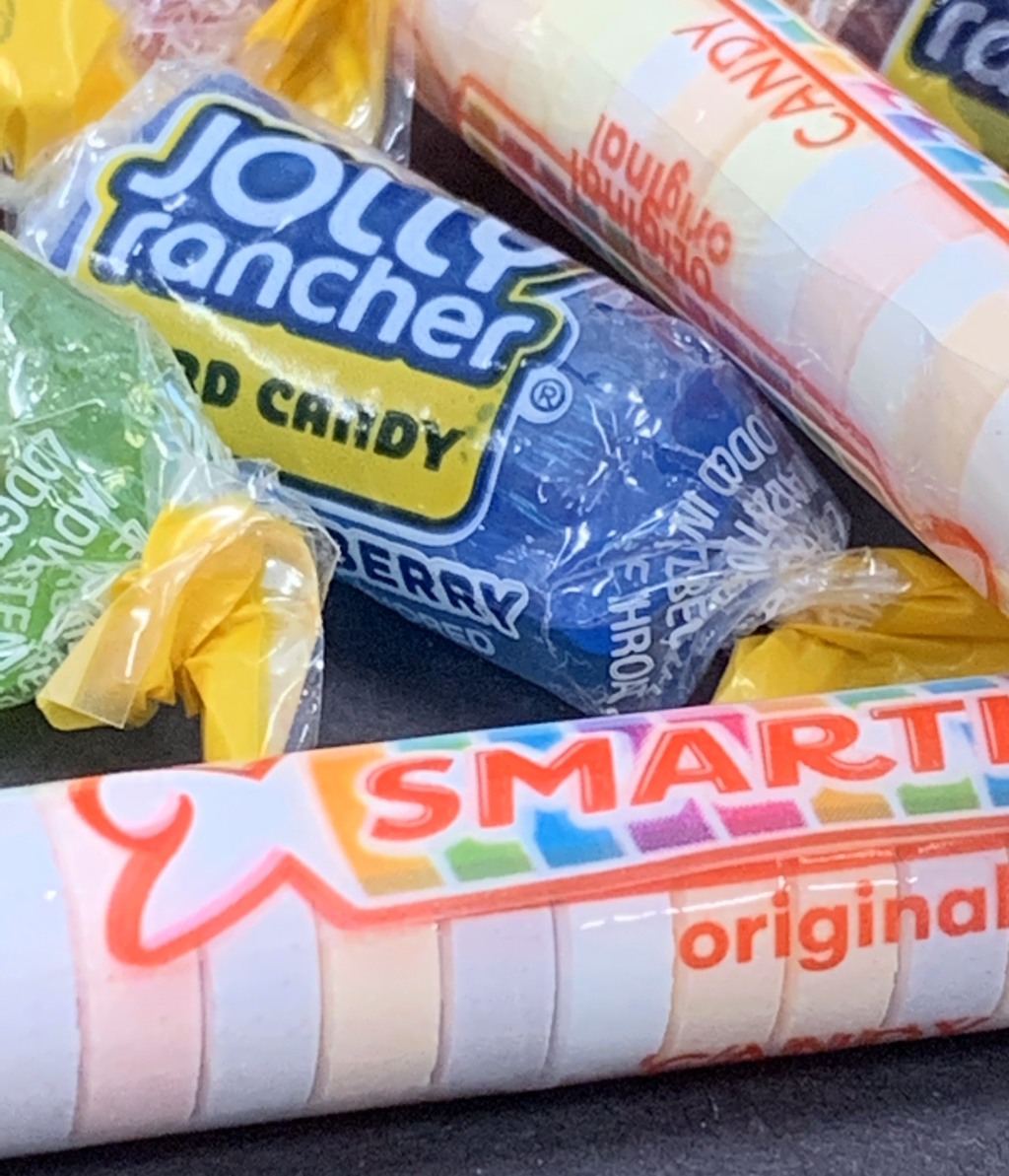
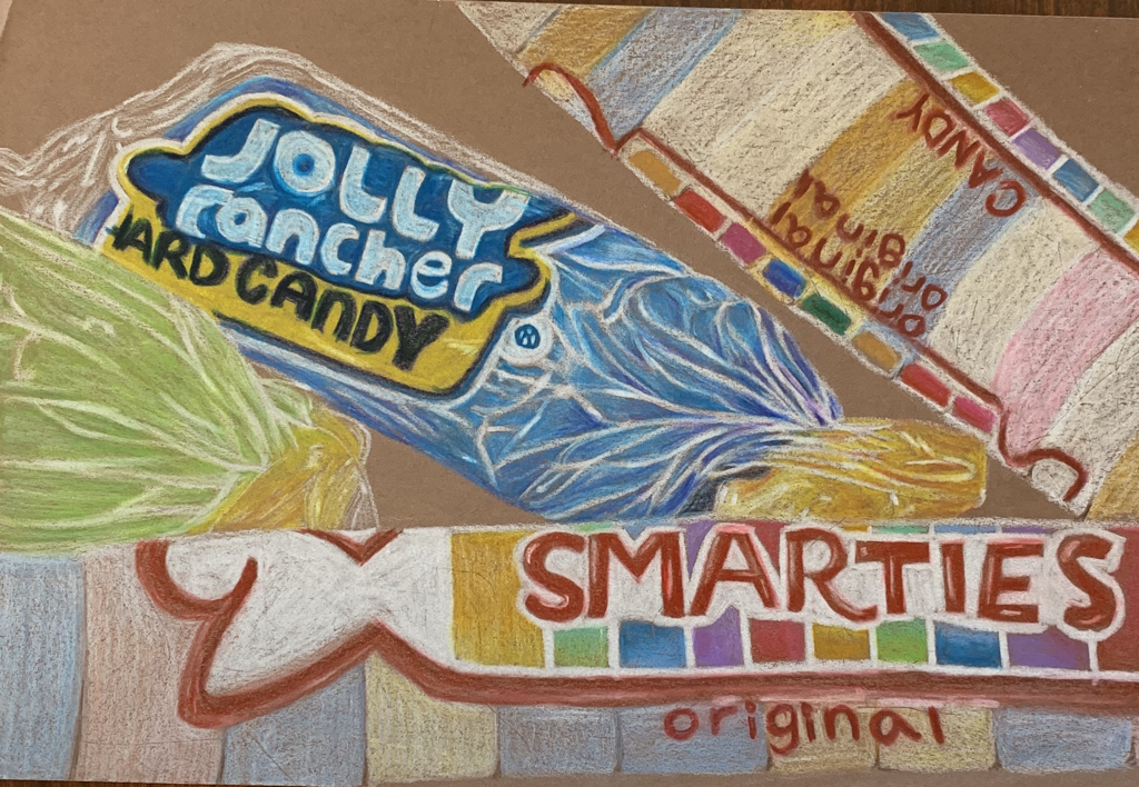
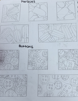
Prisma Color Candy
Group Objects with Color- Reference Photos
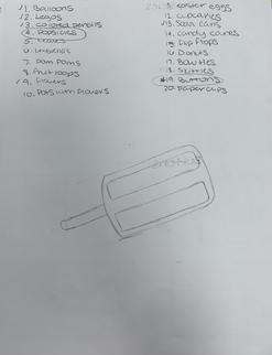
Group Objects with Color- Ideas and Sketches
|
|
|
Grouping Objects with Color- In Progress Photos
|
|
|
|
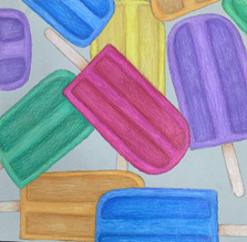
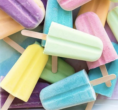
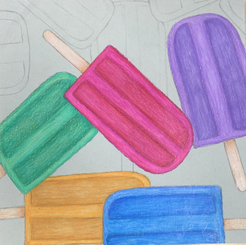
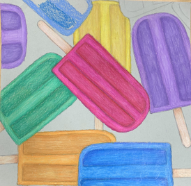
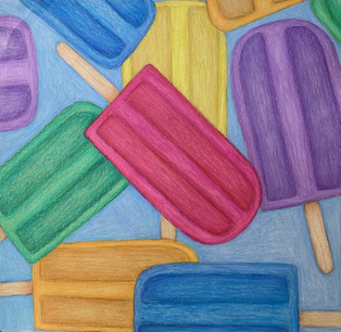
Grouping Objects with Color- Final
Grouping Objects with Color- Questions
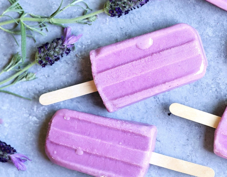
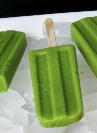
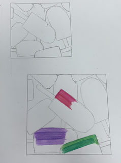
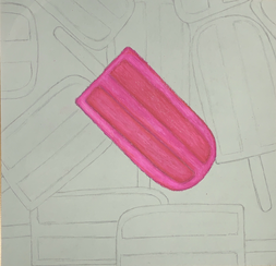
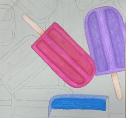
1) The overall composition of my artwork is an even balance with the amount of popsicles I used throughout the whole piece as well as the balance of color. I used come repeats of colors such as the blue and purple but made sure they were spaced out from each other and not creating too much of that color on one side of the piece. The popsicles are also positioned different ways such as being sideways, tilted left, and tilted right to create variation.
2) My value created dimension by creating shadow on the edges of the parts of the popsicle that dip and create indents. I also added white to parts of the popsicles where there would be an icy look. This is very important for me to add because without the value that creates the dimensions, the pieces would look flat as well as the colors blending too much together creating a more cartoon look.
3) By me using exaggerated color, I was able to have my drawing pop and have eyes drawn more to my piece. Along with that, creating exaggerated color on the highlighted areas and shadow areas had the image look more three dimensional. I found using several different colors throughout the drawing that are all vibrant brought the piece together to stand out.
4) For the use of colored pencils, I layered different colors to achieve my desired values by starting with lighter colors and working my way up to the darker colors to create dimension and shadow. For the icy look however, I found adding the white on top after I layered the darker colors worked to create the effect. I wanted the popsicles to stand out and pop in the piece so I added a light pastel color for the background to now draw away the attention of the drawing.
5) I was able to achieve depth by adding highlights and shadows as well as a solid background to look like a table or some type of cloth. The highlight on the tops of the popsicles helped to create the foreground by making them not completely flat. The shadows on the side of the popsicle and well as in the indentations created a middle ground to show what parts of the popsicle is raised.
6) I enjoyed the use of colored pencils but found difficulty in figuring out how to create the icy look. For my color sketches, I thought of the idea of layering the white on top once the shadow and main color of the popsicle was completely colored. This technique created the effect I wanted and so I used that on my final artwork. One of my favorite mediums is prisma colored pencils because of how easy they are to layer and create many different colors.
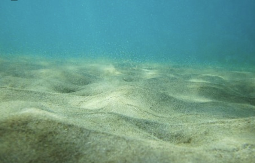
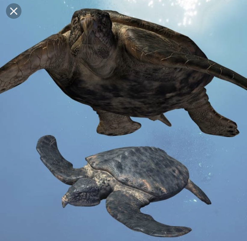
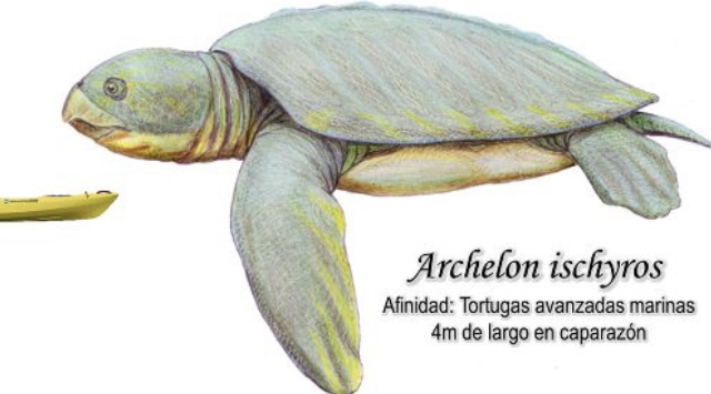
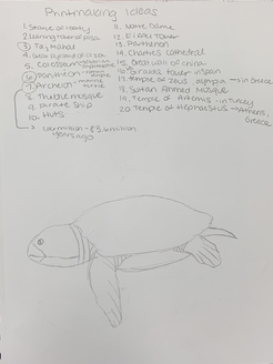
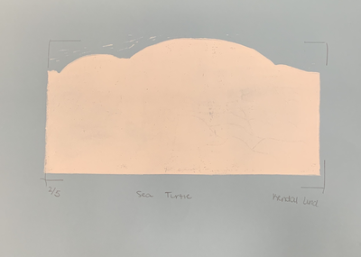
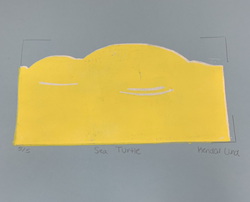
Printmaking reference photos
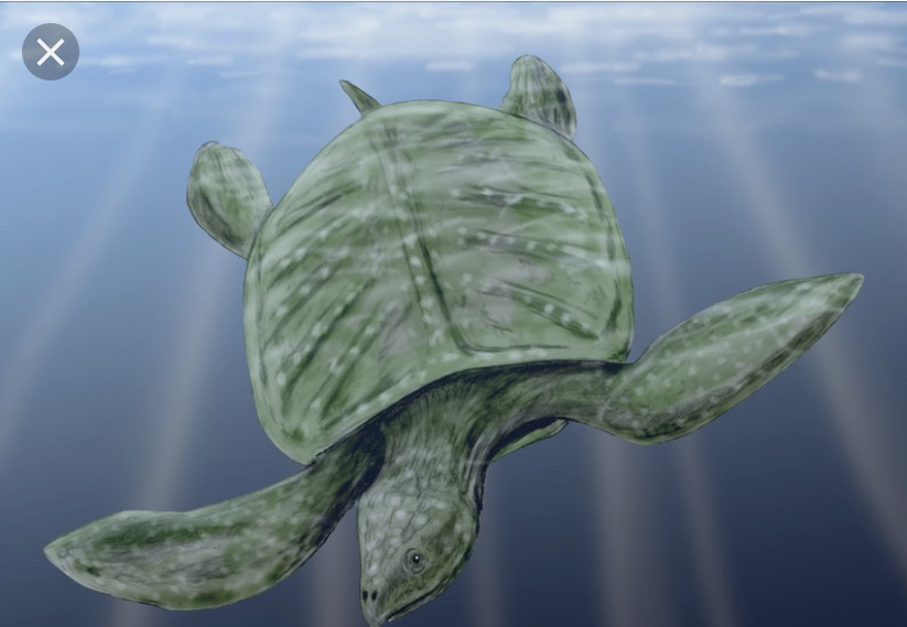
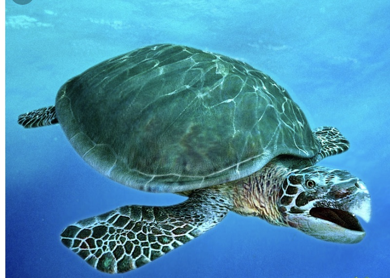
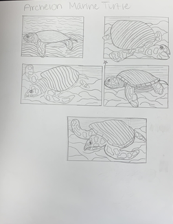
Printmaking ideas and sketches
|
|
Printmaking Final Sketch
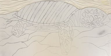
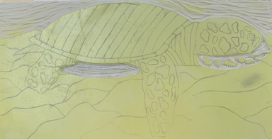
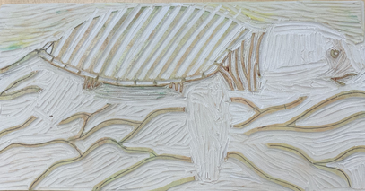
Printmaking in Progress
|
|
|
|
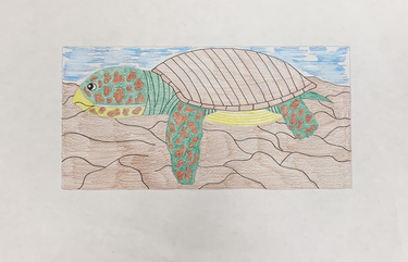
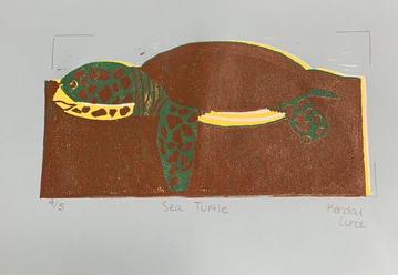
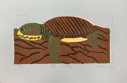
Printmaking Final- Archelon Turtle
Printmaking Questions
1) The craftsmanship of my prints with the registration and carving was that I started with the lightest color for printing and worked my way up to the darkest color. The background color I used was the blue color for the water. I used the different sizes for carving to carve out the smaller parts along with the larger groups to carve out. The white, black, and yellow required the smaller carving tool 1 and 2. The brown, blue and some of the green required the larger sizes for carving 4 and 5. To have the actual turtle and its shell along with the ground to not have one solid color, I used black to outline which created texture to my piece. For the burnishing and ink coverage, I had a hard time putting enough green ink as well as brown ink. The more prints I did, the more coverage I was able to get but still was not very opaque after I rolled a lot of ink on the slab. The first layer of burnishing I was not able to line up the slab onto the paper very well. On some of the copies yellow and white come out on the sides of the paper because I had a hard time layering exactly on top of one another.
2) How I used texture in my piece is by using black to outline parts of the archelon sea turtle as well as the ground. The outlining on the turtle creating the indents on the shell and the outlining on the sandy ground helped it not be flat and show bumps for the texture. For the color harmony, I used the colors from the turtle that I researched which were brown and green. I found a light blue being the water for the background would help the turtle pop more because of how dark it is. The black outline helped separate pieces and also helped the piece stand out more. For balance, I had an equal amount of brown spots on the turtle throughout as well as using an equal amount of texture from black lines throughout the bottom of the ground.
3) If I could recreate my piece, I would add more texture in the blue water by possibly adding darker blue. I would also add possibly a lighter blue color for the ground so it would not have the same shade of the shell and the pattern of the turtle. Also I would try to be more careful with lining up my prints more even though I find it to be a difficult thing to do.
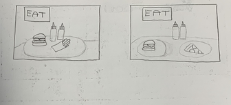
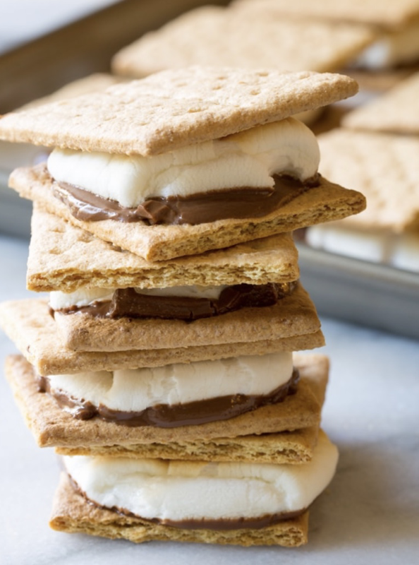
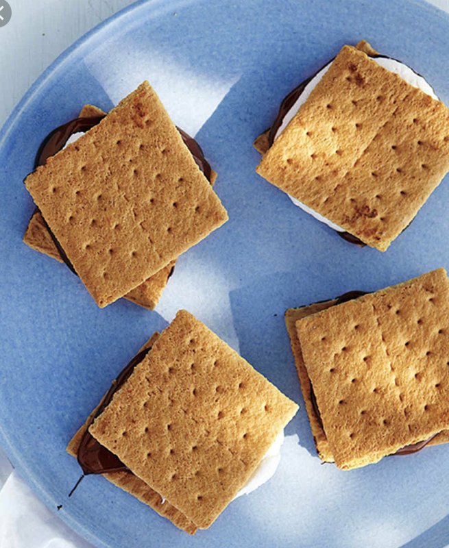
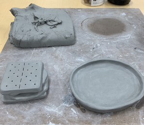
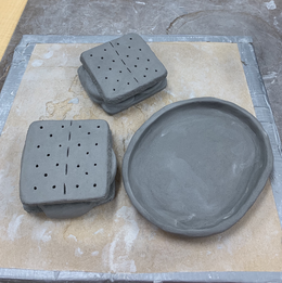
Clay Food Reference Photos
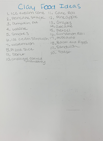
Clay Food Ideas, Sketches, and Terms
|
|
|
Clay Food In Progress
|
|
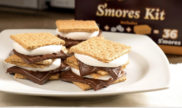
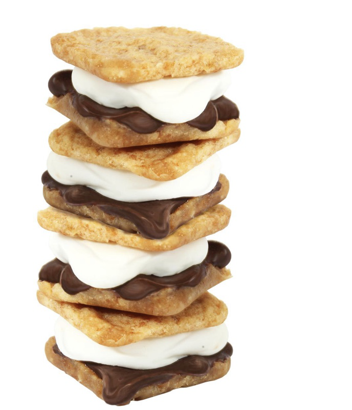
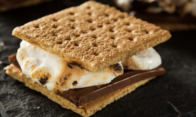
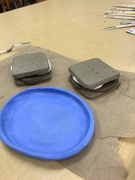
Clay Food Final- Smores
Clay Food Questions
1) The craftsmanship of my sculpture is that all of the pieces are attached well and that the scoring of the pieces are not visible. On the sides of the graham crackers I created a rough texture and had the chocolate and marshmallow parts smooth. To tie the smores together, I added a plate to be able to stack them on top of each other. For the smores I added the melted effect to look more realistic.
2) The most difficult part of this project was the plate. Since I wanted to make a round plate and the sides be raised a little bit, it was hard to keep the plate that shape because I didn't use a mold. Overall, I'm happy with how the plate turned out and the sides stayed elevated.
3) My color choices go together because of the accuracy of the colors to the real food as well as the cool colors. Since I used a cool brown for the graham crackers and chocolate, I decided to do a cool blue for the plate to go with the s’mores.
4) The sculpture is interesting from all views because smores look the same from all sides. I have the chocolate and marshmallow dripping from every side of the smores which creates a realistic look because solid chocolate and marshmallow on the s’mores would make the sculpture look more cartoonish.
5) Doing something in 2D looks not as realistic because of the lack of dimension. Along with that, it's harder to create texture 2D than 3D. Making accurate sizes and dimensions 3D helps the artwork look real and can be held. Objects such as food are 3D so doing the same with your artwork can create a more identical look to the real object.
6) How I created textures in my sculpture is by using the needle tool and scraping the sides of the graham cracker to look rough and look broken off. I also used the needle tool to create the holes at the top of the graham crackers. For the chocolate, plate, and the marshmallows, I used my fingers to smooth out those parts to create the smooth effect like they're melted.
7) My sculpture does look like actual food because of the accurate size and texture of the piece. I accomplished this by using a ruler to measure out the sizes of the graham crackers and then smooth and cut out the pieces for the marshmallow and chocolate. I also used the needle tool to create the rough texture on the sides of the graham crackers.
8) If I were to do this project again, I would possibly create one or two more smores and make them a little bit smaller to be a more accurate size. I would also add a bite mark on one of the smores and with that, add texture to the chocolate, marshmallow, and graham cracker from the bite mark.
Wassily Kandinsky
By: Kendal Lund
|
Wassily Kandinsky was a Russian artist in the early 1900’s that was highly influenced by abstract art as well as modern art. He was born on December 16, 1866 in Moscow. He was inspired by post- impressionism and expressionism. He found an interest in art at a young age and graduated at Grekovodessa Art School. After that, he enrolled at University of Moscow where he studied law and economics. Outside of artwork, he had interest in piano and the cello which was another form of inspiration for him. His successful artwork had him become credited as the “pioneer of abstract art”.
Many of his paintings consist of abstract art while others such as his landscapes have a lot of textures creating a 3 dimensional look in his artwork. Many of his art pieces are compositions with different shapes and colors. Kandinsky believed the color yellow disturbed but the color blue awakened spiritual aspirations. He used many different brush strokes such as stippling for the texture and 3 dimensional effect. His use of bright neon colors and different shapes is used in landscapes as well as pictures based off of music. His art piece called “The Blue Rider” was created in 1903 during the period of expressionism. The piece is of a rider in blue that is on a horse speeding through a meadow. Kandinsky used mainly the stippling technique for the texture as well as the use of oil paint. Many different shades of blue, yellow, and green are used on the blue rider and on the grass. There’s mainly a use of darker shades and the color yellow is used as a highlight as well as the light blue sky. Another one of his pieces “ Railroad At Murnau” was created in 1909 in the same period of expressionism. This artwork was also created with the use of oil paint. The piece is of a train riding on a railroad track. The train is a darkened by using black while the background is of bright yellow, orange, blue, and greens. The stippling isn’t as heavy used as the first artwork and the strokes are more smooth. |
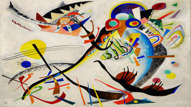
One of his abstract art pieces
"The Bird Painting" 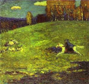
"The Blue Rider"
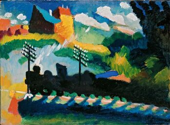
"Railway At Muranau"
|
Resources
“607 Artworks, Biography, Books, Quotes, Articles.” Wassily Kandinsky, www.wassilykandinsky.net/.
Miller, Renée B. “Wassily Kandinsky's Symphony of Colors.” Denver Art Museum, denverartmuseum.org/article/staff-blogs/wassily-kandinskys-symphony-colors.
“Wassily Kandinsky and His Paintings.” Wassily Kandinsky: 100 Famous Paintings Analysis and Biography, www.wassily-kandinsky.org/.
“Wassily Kandinsky Paintings, Bio, Ideas.” The Art Story, www.theartstory.org/artist-kandinsky-wassily.htm.
Painting Mini Assignments
|
|
|
I did 3 value charts using blue, yellow, and red. On the left side I mixed in white to create highlight colors and then I mixed black on the right side to create shadow colors.
|
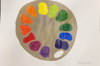
I created the Color Wheel by using paint to look like a paint palette. I used the primary colors to mix and create secondary, intermediate, and complementary colors.
|
